After their Wilmette home of three decades suffered significant smoke and water damage from an attic fire, John and Pam McCambridge turned to architect Mike Shively and interior designer Marshall Erb to revitalize the house for their next chapter in life.
Shively had just redesigned their garage and swimming-pool patio, creating a chic area with new lighting and an outdoor shower, and they were pleased with his work and approach. “I love Mike’s energy and enthusiasm,” Pam says.
TEARING DOWN THE WALLS
Before work commenced, the contents of the house were removed and sorted. Then, they were discarded, donated or cleaned. Once empty, the interior was gutted down to the studs, and the joists were scrubbed to eliminate the lingering odor of smoke. Left with a blank canvas, Shively implemented his changes. Eliminating the wall between the entry foyer and the formal dining area enhanced the flow, for example, flooding the interior with natural daylight.
THE ART STUDIO
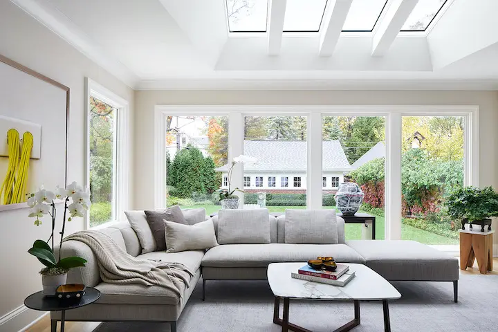
Adding multiple roof dormers transformed an unfinished attic into a functional third floor that houses Pam’s art studio. “It’s very calming and fun place to paint,” she says. Pieces of her art are displayed throughout the house, including a figurative drawing in the studio and several framed fine-art photographs in the family room, which has abundant natural daylight from skylights over a low-slung sectional sofa by B&B Italia. “The color palette is pale, which provides a great backdrop for their art collection,” Shively says.
THE FORMAL LIVING ROOM
Indeed, a graphic black-and-white work by Linda Stojak takes up nearly an entire wall in the formal living room, where a tailored sofa from B&B Italia faces a traditional fireplace mantel. It’s one of the only things that was salvaged after the fire, so Shively refinished it and added a new black granite surround and threshold.
THE WET BAR
By shaving space off the living room, Shively found room for a new wet bar with a built-in wine refrigerator in between the living room and the family room. In a clever move, the backs of the upper cabinets are windows, letting light into what would ordinarily be a dark corridor.
“The rooms flow and reveal themselves as you move through the space, but it isn’t a totally open floor plan,” Erb points out. “This pays homage to the original layout of the home and works so well for the clients to enjoy each individual space and maintain a sense of coziness and privacy.”
THE KITCHEN
While the kitchen remains in the same footprint, Shively’s modifications make it feel far more spacious, not to mention more functional. Unlike the pre-fire ones, the new white cabinets go all the way up to the ceiling and take up nearly the entire wall. “It’s not a large space, but we did everything we could to make the most of it,” he says.
Light quartzite countertops accent both the painted white cabinetry and the stained oak island, which has an elegant recessed panel motif that also serves as a door pull.
THE POWDER ROOM
The same sense of simplicity informs the powder room, where an illuminated mirror and a vertical reveal along one corner creates a soft glow that highlights both the textural grasscloth-covered walls and the rustic 3-to-2 stone tiles behind the floating wooden vanity. “The tile has this gnarly texture that looks amazing,” Shively says, comparing it to Japanese pottery.
THE UPSTAIRS BATHROOMS
Shively also designed his and hers bathrooms on the second floor, which now has three spacious bedrooms rather than four smaller ones, and a brand-new bathroom on the third floor, not far from the fire that led to the project in the first place. “This was a fresh start for their empty-nest life,” Shively says. Indeed, the couple are pleased with their decision to rebuild and the pandemic has made them especially grateful for their new abode. “Mike’s design is refreshing and uplifting,” Pam says.
More from SPACES:
- A Mill Valley Home for a Family of 3 is Laid-Back, Light-Filled and Modern
- This Corte Madera Remodel is Cool on the Outside, Warm on the Inside
- 4 Designers on Their Favorite Modern Decor Pieces
Tate Gunnerson is a Chicago-based freelance journalist with an equal appreciation for natural beauty and good design. He is a passionate supporter of St. Jude Children’s Research Hospital and the National Kidney Foundation.

