STARTING A RESTAURANT IS A DAUNTING TASK: a quarter of them fail within a year, and most small establishments close within five years. Though there are many factors which account for a restaurant’s success — food quality, service and location, for example — design can be an important consideration for a brand’s success. In an age when we are more attuned than ever to visual cues (thanks, social media!), restaurant design is more consequential than ever.
Back in 1961, Ray Kroc wanted to entice the public to eat at the burgeoning chain of hamburger restaurants he just purchased — McDonald’s — and used the latest marketing science to design the iconic red and yellow restaurants. Red was chosen for its stimulating properties, a signal to your brain to kickstart your appetite. “Warm yet lively colors like red are energizing which helps to stimulate the appetite,” says Nathan Reed, Senior Interior Design Associate at Cass Calder Smith Architecture + Interiors. The pigment’s power is further charged with social and cultural meanings — think of a matador’s cape or a red fire truck — that excites eaters. Yellow, a happy color, signals joy. Yellow is also most visible in daylight, a beacon to drivers and the hungry kids in the back seat. “Warm and comforting colors like yellows, golds and orange cause people to feel relaxed and happy and have also been shown to increase metabolism,” says Reed. Considering the international success of the brand, with over 13,000 outlets in the United States, McDonald’s cultural color cues are enticing to many humans.
In the Bay Area, Michael Brennan has been designing fine dining restaurants for decades, including Fleur de Lys, Cliff House, Zero Zero, Baker & Banker, Bruno’s and many more. Since his first project painting murals for Pat Kuleto at the wonderscape of now-closed Farallon, Brennan, a trained painter, refuses to rely on a set color palette when designing a restaurant. “That is the last question for me,” he says. “I figure out all the other details first — architecture, lighting, how things are laid out — and make sure it works before I make decisions about anything.”
From the guest’s perspective, that often means lighting is higher in the design hierarchy than color. “You have to light the atmosphere, make people look in and say ‘wow, I want to be in that space,’ Brennan confirms. Lighting is a big part of a restaurant’s unique experience — people need to look good in the restaurant, and Brennan wants women to look great in the bathroom mirror, too. But when it is time to consider the color palette, Brennan searches for harmony. He starts with a trim color, usually something dark, and then figures out the food. “You can get away with brighter colors in some spaces,” Brennan says. “You want colors with the same tone — I try to keep things exciting and harmonic.”
It is a delicate balancing act. Subtle yet highly effective techniques deliver messages to denizens of social media and the types of eaters a restaurant wants to attract. “Colors must be comforting first and foremost — there is not necessarily any one color that is wrong to use in a restaurant, but some colors do lend themselves to a more pleasant experience (which is important when the appetite should be stimulated),” says Reed. Blue, for example, is said to be relaxing, promoting a sense of calm in diners, much like the feeling one gets when near the ocean. Brown is thought to convey a down-to-earth message and a strong sense of security. Green signals abundance and health. Dark tones are often used to convey coziness or to make a space feel more intimate while lighter colors make a more welcoming. “In general, colors of natural elements and colors found in nature give us an association with food that is healthy and delicious to eat,” Reed adds.
Balancing the psychological implications of color to make guests feel comfortable and hungry is a key element in restaurant design. “Since everyone is different, people perceive and interpret colors differently,” Reed says. “Perception of color can vary greatly depending on surrounding shades and hues as well as the color temperature of the light hitting it. Also, color blindness is a thing,” Reed remarks. Here is how design influence the eating experience at some Bay Area restaurants.
iChina | Green and Blue
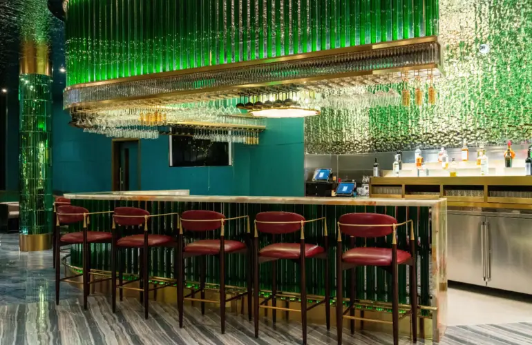
Inspired by the ancient palaces of China and led by Mr. Zhongxuan Hong, HHD Hong Kong Eastern Holiday International Design chose a mix of green and blue for iChina’s interiors. “The green that is used is the color of the precious jade that the owner loves and the designer took inspiration,” Hong wrote in an email. “The blue is influenced by the painting “A Thousand Miles of Rivers and Mountains,” gifted to Emperor Huizong of the Song Dynasty (960-1279 AD) by the renowned court painter Wang XiMeng.
Aiming for a feeling of refined elegance, the team created iChina’s signature color palette of green and gold with red toned accents for added warmth and style which nods to Chinese tradition and culture. From there, an Art Deco design aesthetic balances clean lines with geometric shapes — look at the grand lighting fixtures or the turquoise blue leather walls and crystal pillars, or the detailed lanterns in the form of ancient Chinese architectural buildings.
But does it make you want to eat? “The design pulls from iconic landscapes, grand palaces, and the artistic excellence of imperial China,” Hong wrote. “A reflective water ripple ceiling resembling a mirage in the stars [among other details] is meant to create a sense of endless prosperity and a luxurious yet welcoming atmosphere.” I’ll take that as a “yes.”
Due West at Olema House | Dark Blue
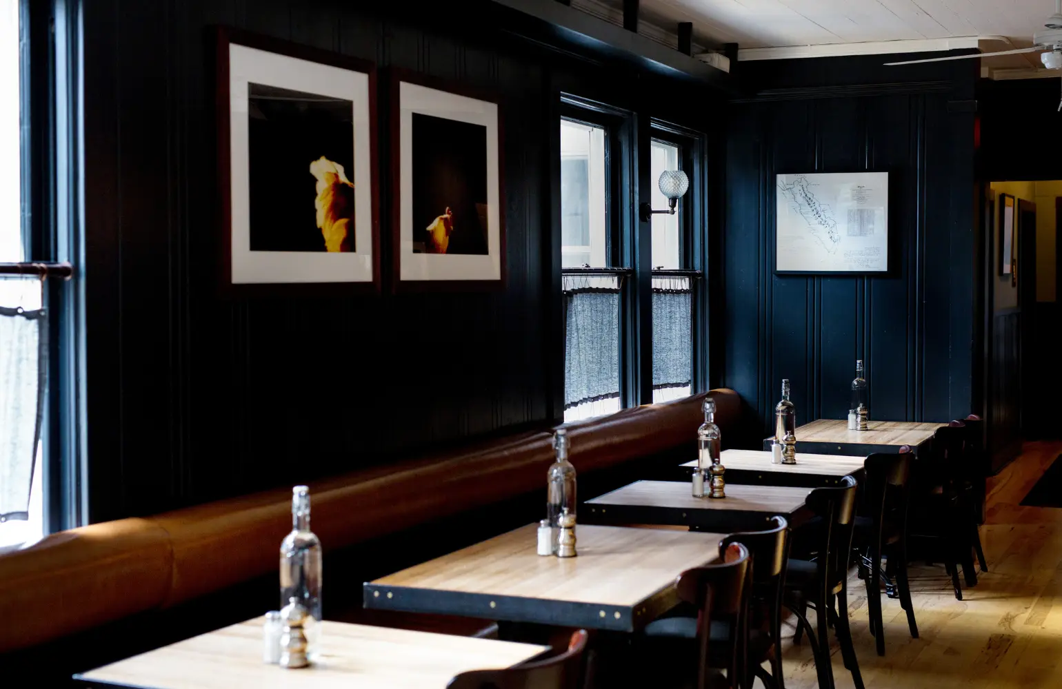
“Traditional with a pop,” says Nadine Curtis, Vice President, Design Project Manager of Palisades Hospitality, who sought to reflect the cuisine of a modern tavern at a hotel’s stand-alone restaurant that skirts the Marin coast. That meant leaning into shades of blue. Together with vintage artwork, antique glass and a saloon-style mirror behind the bar, the goal was an interior that reflects the beauty of the abundant open space and California landscapes that surround the property. The blues shift with the time of day and the fog, creating a warm and cozy effect when days are chilly and a welcoming coastal vibe at other times.
KAIYŌ Rooftop | Green
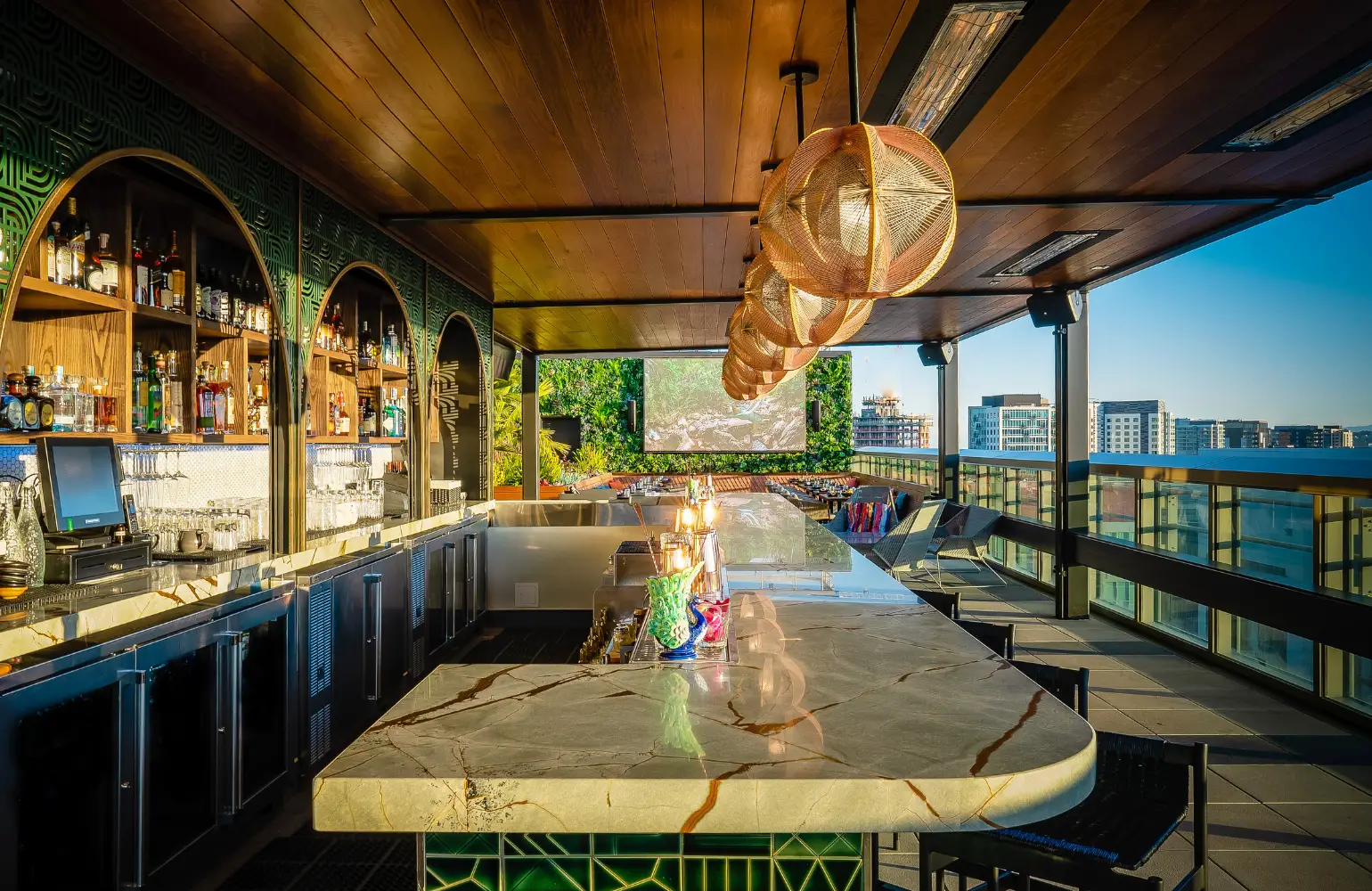
Owner John Park with William Duff Architects and Roy Design chose a balance of vibrant colors to represent South American culture and earth tones to represent the Amazonian influence in Peru. The result is a vivid green bar with angular designs baked into the bar tiles, perhaps to evoke Peru’s ancient Nazca Lines, above which cool coppery valences shade bar lights. “We wanted our guests to feel transported out of the hustle and bustle city life,” said Park, “a Nikkei oasis that brings a culinary experience and lush feel of Amazon together as one.”
But does it make you want to eat? “I understand certain colors evoke hunger and crave food [sic] but KAIYŌ is about the complete experience and not just food. Our colors represent the Nikkei culture in Peru.
the caprice | White
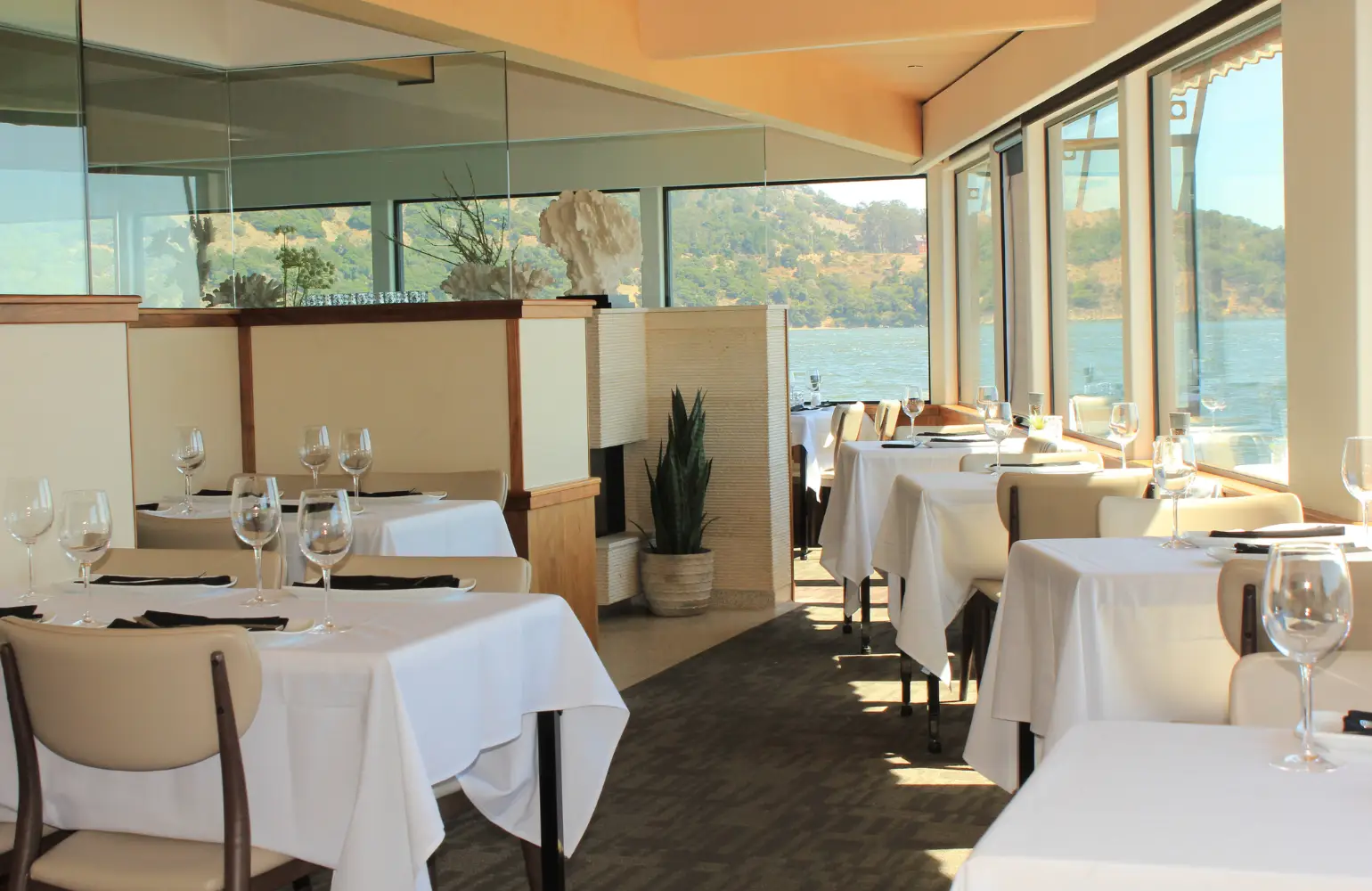
Jennifer Dal Bazzo, owner and interior designer, designed the interiors to complement the stunning views of San Francisco, visible across the bay from every seat. Dal Bazzo chose white as a dominant color for its very clean and fresh appearance. “It also allows the focal points — spectacular views, bar, and fireplace — to become boldly displayed,” she says. Like Morrone, Dal Bozzo had a vision for the floor: terrazzo tile was chosen for its color schematic, which resembles a sandy beach. Complementary colors of beige and peach with walnut and maple woodwork reflect serenity and warmth.
Nectar and Cortez | Yellow
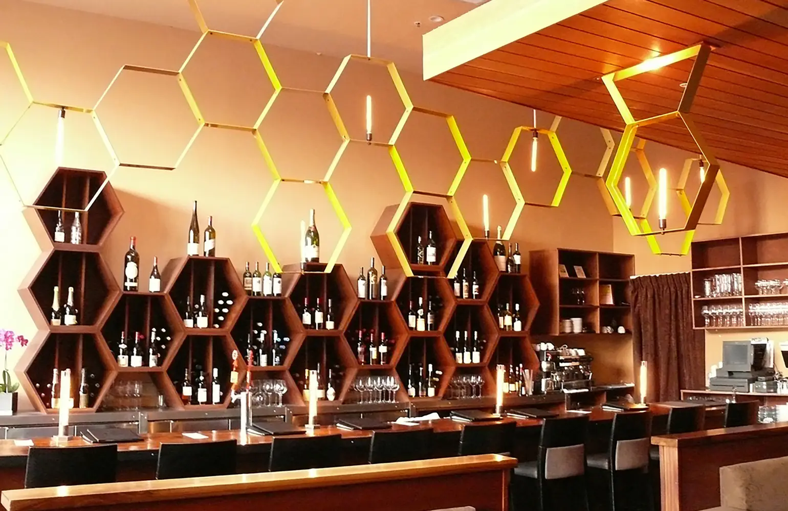
At Nectar, Brennan first imagined a hive, designing a set of hexagonal, interlocking bent light fixtures to represent the sweet liquid secreted by flowers to attract pollinators. “I streamlined the color scheme around that,” he says. A neutral palette of warm-toned beiges and browns served to highlight the food as well as the architectural elements of the room.
Brennan often looks to art history as a foundation on which to build his designs. With Cortez, the Spanish surrealist painter and ceramicist Joan Miró, and the Dutch painter and art theoretician Piet Mondrian inspired bent pipe light fixtures affixed with colored bulbs and a color-blocked wall. The resulting room was infused with warmth from warm lighting and various tonal yellows and golds used throughout the space. “I thought a lot of deep yellows would work with the light fixtures,” Brennan said.
Tosca Café | Red
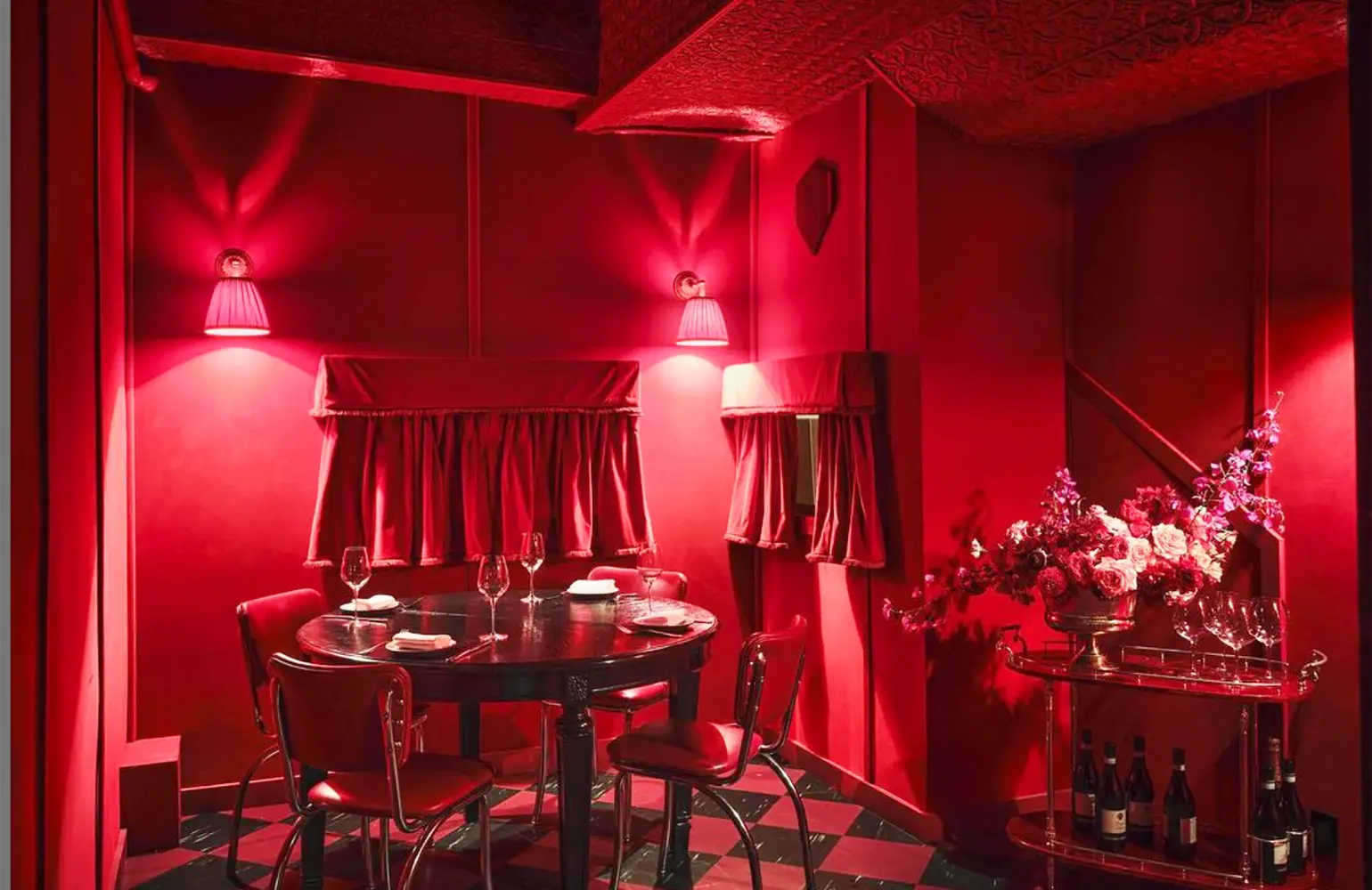
If red, an energizing color, is supposed to stimulate the appetite, you should be starving after spending some time in 102-year-old Tosca. An icon of the North Beach dining scene, Tosca hews to its storied form with deep red leather banquettes, a mahogany bar (itself a sort of reddish-brown), red damask wallpaper and red chairs. It’s red in here.
Lily | Gold
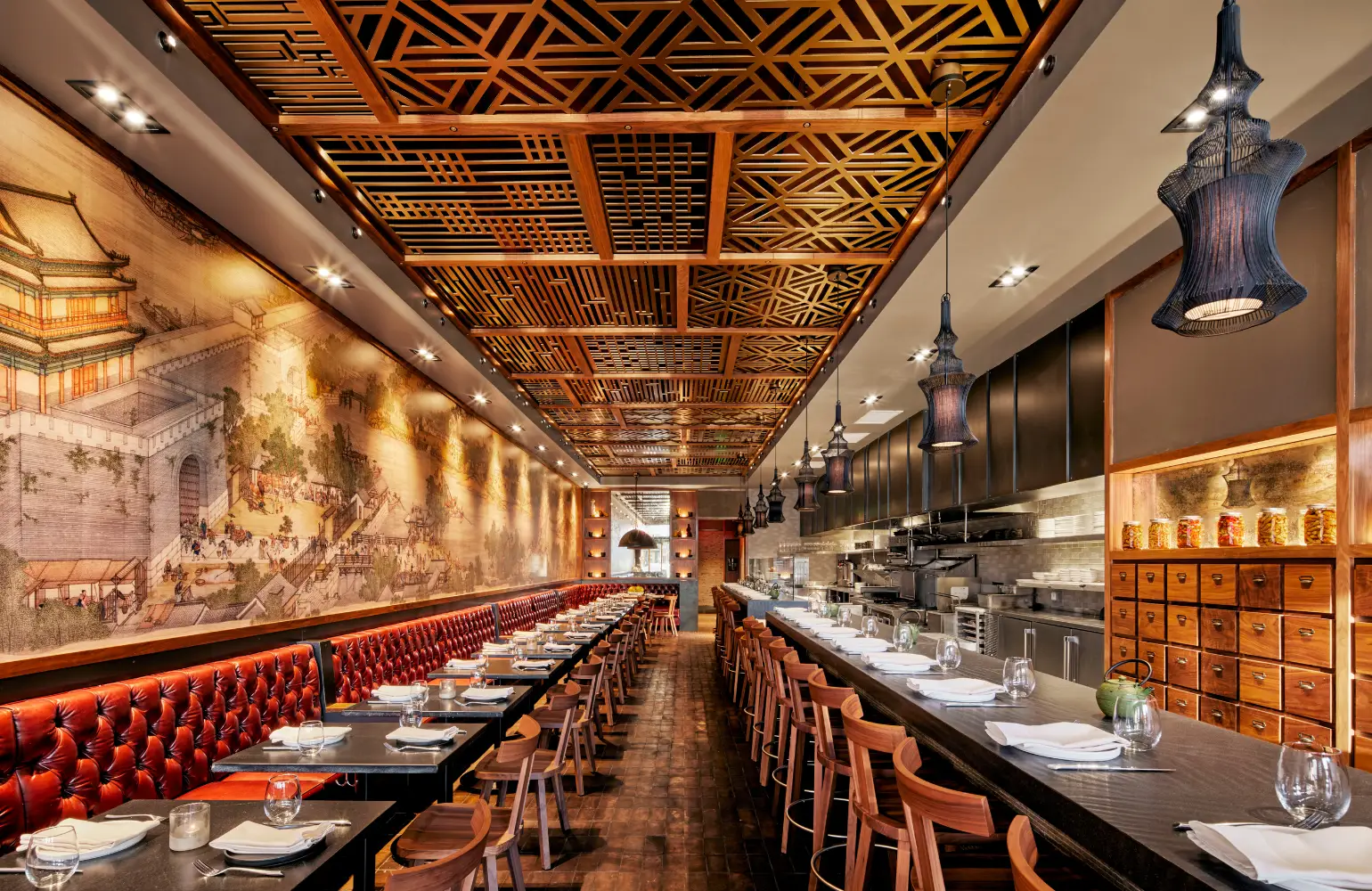
Reed chose gold as the dominant color for a Vietnamese restaurant for its positive effects on diners as well as for its association to good luck and prosperity in many Asian cultures. “We wanted to pay homage to the owners’ culture,” Reed said. The design team sought inspiration from the Five Elements as well as an important piece of art called “Along the River During the Qingming Festival” which features a predominantly golden hue. Reed drew on design elements from East and West, ancient and 20th century, to help people experience the comfort of natural elements and a traditional space while being surrounded by familiar modern touches.
But does it make you want to eat? Reed said that the warm colors his team chose help people to feel relaxed and happy and they even increase metabolism. Adding in energizing colors like red are said to help to stimulate the appetite.

Christina Mueller is a long-time Bay Area food writer. She hails from the East Coast and has spent way too much time in South America and Europe. She discovered her talent as a wordsmith in college and her love of all things epicurean in grad school. She has written for Condé Nast Contract Publishing, Sunset, and the Marin Independent Journal, among others. She volunteers with California State Parks and at her childrens’ schools, and supports the Marin Audubon Society, PEN America, and Planned Parenthood. When she is not drinking wine by a fire, she is known to spend time with her extended family.
