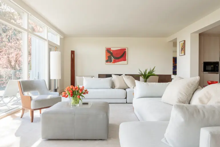
With a few elegant moves, Sausalito designer Martin Kobus gave a tired Belvedere kitchen and living space a much-needed face-lift.
ABOUT A YEAR AGO, Julie Wainwright, the founder and head of The RealReal, an online luxury consignment art and fashion store, asked Sausalito interior designer Martin Kobus to update the middle floor of her trilevel midcentury modern home in Belvedere. It included a foyer and living room that guests saw first, a conventional kitchen on one side and a somewhat cramped dining room on the other.
Kobus happens to be Dutch with a penchant for European-style modernism. He had cleared out extraneous walls at his own formerly dark house by the water on Corinthian Island, and he’d raised ceilings to provide a loft-like living room with white walls for art and big picture windows. He suggested similar improvements.
To provide a sense of space, he and his client decided to remove a partition wall between the kitchen and the living room, whose French doors open onto a cantilevered deck that received new clear glass railings. Now, from several vantage points in the kitchen, “Julie can look across the living room at unobstructed views of Belvedere Cove,” the designer says.
The new kitchen, similar to one Kobus created for the 2016 San Francisco Decorator Showcase, incorporates appliances from Thermador, Miele and Viking. Its central white Neolith-covered food preparation island has a protruding fin made of laminated walnut wood and resin that forms an L-shaped dining counter.


Flanking the kitchen’s new back galley counter an old window on the left and a back door on the right became symmetrical floor-to- ceiling clear glass openings that look onto a shallow back patio. The new fenestration adds to the illusion of an ample rear garden; increased daylight also means that a pendant light from Stickbulb is switched on only at night. On the south side of the kitchen, a concealed pocket door can close off the dining room during dinner parties but new floor-to-ceiling windows make the room feel capacious.
To help all three rooms feel even larger, Kobus bleached their oak floors and painted their walls a uniform pale gray-blue to display Wainwright’s vibrant art collection from The RealReal.


In the living room, a traditional hearth and mantel with built-in bookcases on either side were removed and covered by a wallboard fascia; the original fireplace now appears larger, inset into a slightly recessed horizontal channel and tiled with an inch-thick slab of stone-like easycare Neolith porcelain from Spain. Although it takes up more floor space, the boxed fireplace adds contemporary flair to the room. Above it, Andy Warhol’s red “Hammer and Sickle” complements furnishings Kobus designed, including rectilinear cabinets and furniture by local craftsman Chris Tomasi. Seating islands float atop a large silk-and-bamboo-fiber carpet that anchors the elongated room.
Everything is kept low to the ground so as to not obstruct the view. With that move, along with the neutral color palette, Kobus has achieved “our modernist objective, without being fanciful,” Wainwright says. That’s keeping it real.

