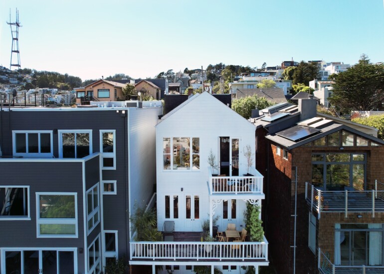
San Francisco architect Monica Sanga and her husband saw many houses in the city when searching for a home to purchase but ultimately, it was an 1886 Victorian that won their hearts. Perched on a dramatic hillside above the Castro in San Francisco, the Corona Heights home looks like a simple one-story cottage from the front. After stepping inside, however, the three-story home unfolds over the hillside, and the panoramic view of the city and East Bay reveals itself. Despite the home’s modest size and narrow footprint — a mere 1,320 square feet with two bedrooms and two bathrooms and only 20 feet wide — they knew immediately it was “the one.”
“My husband is a software engineer, so he’s very methodical, and he had made a spreadsheet ranking all the different qualities that we wanted in a new home,” Sanga says. “But as soon as we walked in, the spreadsheet was forgotten.”
Smitten, the couple made the leap, knowing that some serious work lay ahead to make the house work for their needs. “The biggest pain point was that the kitchen was very small and closed off from the rest of the house,” Sanga says. “Also, a lot of infrastructure was problematic, like there wasn’t any overhead lighting in the second bathroom, and it had a really old toilet with a pull chain — we used to joke that every flush of the toilet cost $8 because it used so much water.” In addition, the primary bathroom was cramped and had an odd layout, while the primary closet was dark and overly large. The outdated plumbing, heating and insulation all required updating as well.
Rather than immediately diving into the renovation, however, Sanga and her husband decided to live in the house for a year to better understand the space and plan the design. “We needed to adapt the home to make it work for modern life, but at the same time, we didn’t want to lose the charm of the house and everything that that we had fallen in love with in the first place,” Sanga says. She also took time to assemble her team for the project, favoring local craftspeople and women- and minority-owned businesses.
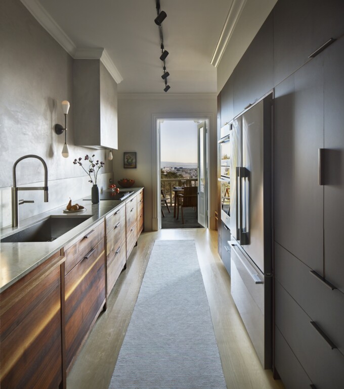
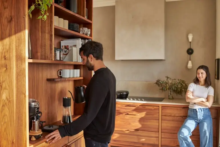
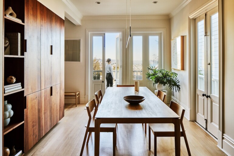
The task of reimagining the tight, Victorian-era spaces for contemporary living may best be likened to solving a puzzle, and post-renovation, the most important piece is undoubtedly “the monolith,” as Sanga describes it. Crafted from locally salvaged timber by San Francisco-based Kaimade Woodworking, the 10-foot long, multifunctional custom millwork structure spans the reconfigured kitchen, dining area and living room. The side facing the kitchen houses a pantry, refrigerator, oven and microwave; the dining room side features cabinets and shelves bookended by a freestanding Jøtul gas fireplace; and the balcony-facing side accommodates a coffee bar. “It was quite complicated for our millworker to put together because there are actually different depths inside depending upon which side you’re looking at,” Sanga says. “He did such a beautiful job of matching up all of the grain patterns and really making it look like a piece of art, yet it’s highly functional at the same time.”
In addition to optimizing the layout, the monolith also serves to define the spaces. “I didn’t want to have a completely open floor plan,” Sanga says. “I like having the kitchen off to the side so that I don’t have to look at the dishes. And, because it’s a relatively compact footprint, having distinct spaces helps provide a sense of spaciousness since you have different areas to occupy.”
The kitchen, which features a grey fume limestone countertop and waterproof polished plaster backsplash, also benefits from several other organizational design details: A small pantry opens to reveal storage space as well as additional countertop workspace, and drawers are precisely dimensioned according to use. “The spice drawer is my pride and joy,” Sanga says.
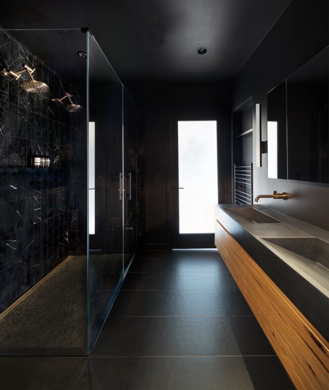
Like the kitchen, Sanga reconfigured the primary bathroom and adjoining closet to improve functionality, in this case increasing the size of the bathroom while decreasing the area devoted to the closet. The spaces were also dark, as the closet is located deep within the house with no windows. Rather than lament the lack of natural light, however, Sanga decided to lean into it. The dark, moody, intimate Japanese onsen-inspired bathroom features black walls, custom hickory millwork, brass fixtures, natural stone tile in the shower, radiant heating and a honed concrete slab countertop. Likewise, the closet features black walls that provide a dramatic backdrop for the custom millwork. “Creating these deep shadows actually gives you an illusion of more space,” Sanga says.
Expanding the sense of space even further in the home, multiple sets of French doors on each floor open to outdoor decks furnished with lushly potted plants and a garden where Sanga and her husband enjoy taking in the view. The doors and brass hardware are original to the house, a conscious nod to its Victorian heritage. Where possible, Sanga also preserved baseboards and trim, and did a custom run to match them in areas where they needed to be replaced.
Bringing the home up to the present, however, are its high-tech automation systems that control of everything from lighting, shades and temperature to door locks and music via voice, phone or tablet. Sanga’s husband was instrumental in researching the home-tech systems, and the couple ended up choosing consumer-grade solutions rather than the hard-wired proprietary systems typically installed in many high-end renovations. “What’s great about off-the-shelf tech is that it can be replaced and adapted when things change, it’s easy to install and it’s really user friendly,” Sanga says.
In the end, the painstaking attention to detail the couple put into the renovation has paid off, resulting in a home that manages to achieve a thoughtful balance between old and new. Says Sanga, “It was definitely a lot of work, but I’m so thrilled with how everything turned out.”
Prop Stylist: Leila Nichols
Engineering: BASE Design, Katy Briggs
Landscape: TALC Studio, Daniel Nolan
