After living in San Francisco for many years, a couple decided it was time to trade busy city life for a more relaxing setting living among the trees in Mill Valley. Although they already owned a home in Mill Valley a few minutes from downtown that had been rented out, the 1960s-era ranch wasn’t yet the serene abode they longed for. It was dark and oddly configured, with boxy rooms and a bulky brick fireplace breaking up the flow of the common areas. The primary bedroom and bathroom felt cramped and unappealing. And, despite the home’s beautiful setting among a stand of redwoods at the base of Mt. Tam, the backyard, which the couple had recently redesigned as a Japanese garden, was only accessible by a patio door tucked away off the corner of the kitchen.
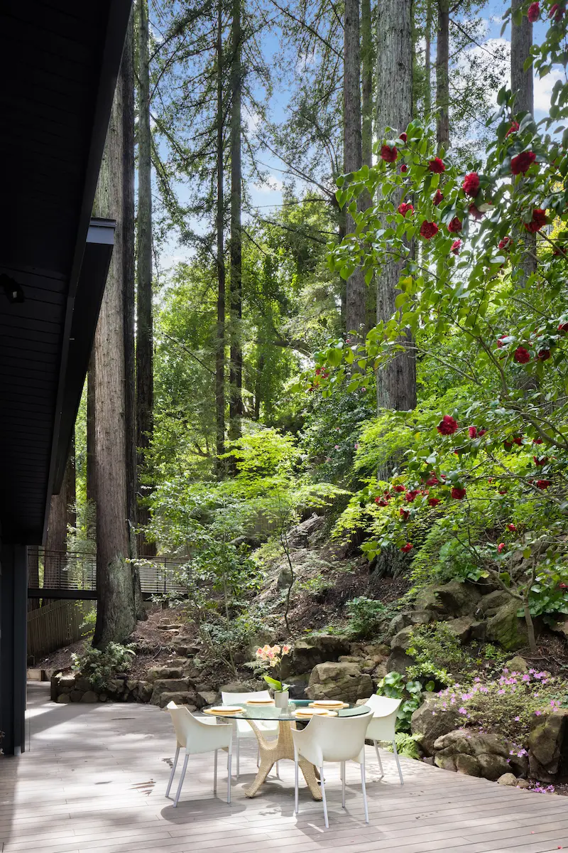
To transform the house, the couple sought the expertise of Kentfield-based architecture and landscape firm Holder | Parlette. While the property’s hilly, forested setting limited the possibilities to expand the predominantly one-story house, Chris Parlette, the principal architect on the project, took a thoughtful approach to overcoming the challenges. “The site was very constrained,” Parlette says. “The backyard was so tight with a huge redwood right outside the kitchen window and a steeply sloping hill. In the front yard by the entry door, there are also some massive redwoods. There was no room to push anything out, so we tried to get as much volume and space as possible just going vertically.”
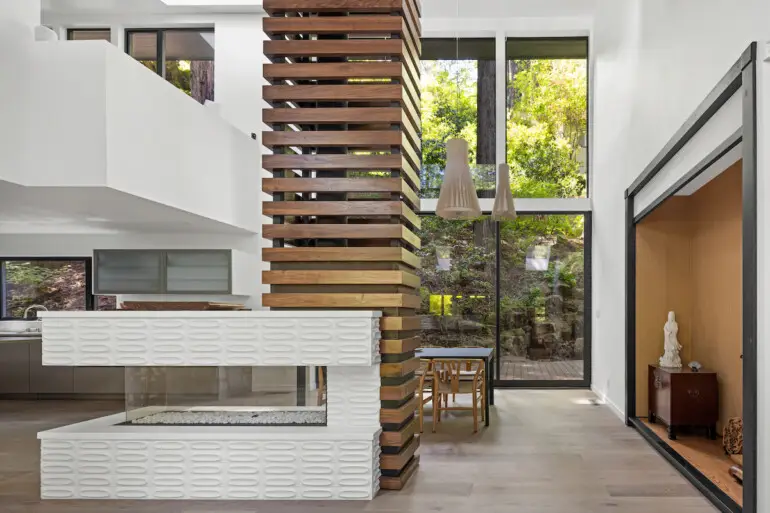
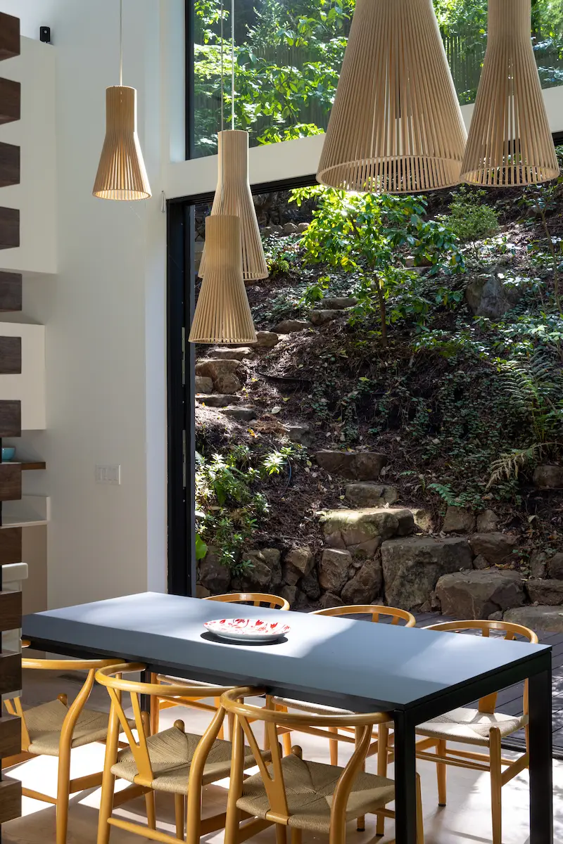
Working within the existing framework of the house, Parlette and contractor K&L Construction reconfigured the space downstairs and then expanded the upstairs space in the back — all with the goal of improving light, flow and access to the outdoors. The team first removed the walls on the lower floor between the kitchen and living room and relocated the kitchen. The fireplace remained in the same location but got a makeover with a three-sided, glass-encased gas insert, Heath Ceramics tile surround and towering wood-slatted chimney, providing a striking visual divider between the great room and dining area. Behind the dining table, a two-story expanse of glass looks onto the backyard, with sliding glass doors that open the space to the outdoors.
“Now when you enter the house, you get this big wow factor of seeing the fireplace,” Parlette says. “Then the whole wall at the rear the house just lifts up into the air, and you’re really in touch with the rear yard. The two-story volume of glass that rises above the dining area became the heart of the whole project.”
The three existing bedrooms and bathroom on the lower level also received a full makeover, with some walls rearranged to make better use of the space. The couple now uses one bedroom as an office space.
Upstairs, the primary bedroom was refreshed, and at the back of the house, an expansion gave the primary bath a major upgrade, creating a combination bathroom, study and closet area that overlooks the dining room and is filled with light. An elevated walkway from the primary bath leads to a meditative garden set above the backyard. The resulting configuration of this space is the culmination of detailed collaboration between Parlette and his clients. “I think we ended up having 15 different versions of the master bath before we landed on the final one,” he says. “It was really an exercise in exploring the possibilities. The clients are very methodical, and we wanted to take the time to get it right.”
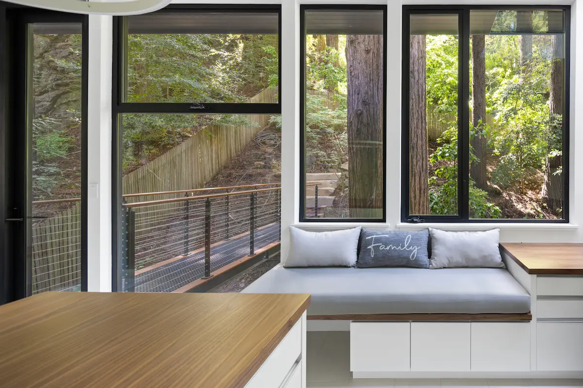
With guidance from Jeff Swanson, founder and partner at Boston firm Charles Street Design, the couple selected interior finishes that fit their lifestyle and complemented the wooded landscape visible through the walls of glass in their home. The aesthetic is warm, earthy and contemporary while celebrating nature. “The clients are admittedly not fans of clutter,” Swanson says. “Clean, simple, minimalistic: Their focus is on the benefits of the calming nature surrounding them.”
The team incorporated walnut and stained-white oak accents throughout the home due to their warm tone and minimalist graining. “The two woods kept one from overwhelming the other,” Swanson says. “We also incorporated glass, high-lacquer and polished stone to allow the light to bounce around the spaces, but kept it restrained so as not to create too much ‘bling’ against all the woods.” Carlisle wide-plank flooring in light walnut and matte finish was used throughout the home to connect the spaces, providing a counterpoint to the glass and lacquer. In the primary bathroom, the green glass tile installed vertically on the vanity wall is a play on bamboo.
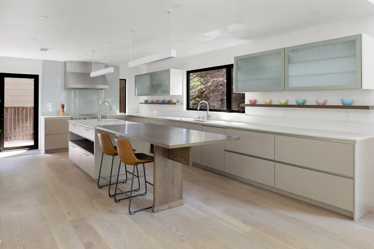
The modern kitchen design is by German firm SieMatic, known for blending warm, high-lacquer tones with refined woods — an ideal fit for the couple’s taste. The back-painted glass backsplash on the range wall provides a sleek, minimalist alternative to tile with no grout lines.
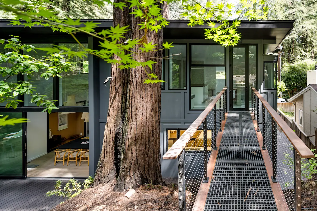
Exterior upgrades included a switch to more contemporary board and batten siding and a darker paint color, however, Parlette stresses that the emphasis of the renovation and expansion was to keep the outside of the home quiet while improving the interior-exterior connection. “From the street, you can barely notice the addition toward the back of the house,” he says. “When you go through the front door, that’s the main event.”
