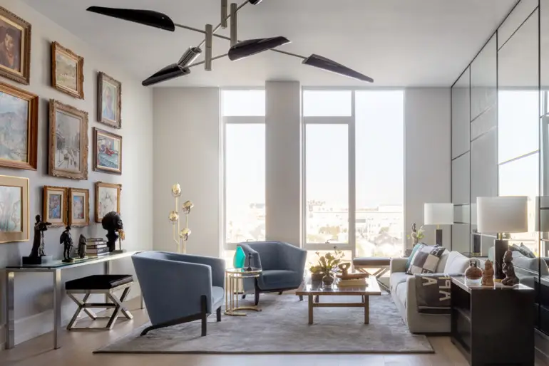
For a San Francisco condominium, designer Eche Martinez highlights timeless works of beauty in a finite space.
FOR SAN FRANCISCO INTERIOR DESIGNER Eche Martinez’s client, who had lived in a somewhat dark home in a Spanish Revival–style 1927 building in San Francisco for decades, the problem was not how to move his traditional and eclectic antique furniture. He could live without most of it.
“The challenge was to develop a new and contemporary space for my art collection,” says the client, a retired research scientist and geneticist who worked at UCSF.
A world traveler, he gathers eclectic art, including pre-Columbian artifacts, works from indigenous civilizations, 20th-century European pieces and American Colonial and impressionist paintings. Moving into a more modern, loft-like environment in the nine-story Pacific building in Pacific Heights, he knew he would have less space for his things. But the collection was not something he wanted sold or packed away out of sight. The oils and canvases were by artists such as Guy Carlton Wiggins, Moses Sawyer, Harry Shoulberg, Jon Corbino and Francois Gall, and some had come with his family when they migrated from Europe and then with him when he moved to the Bay Area from a brownstone in New York.


Martinez’s priorities were to get acquainted with the collection and help decide what to highlight before he got to work for the next four months on the 1,956-square-foot open-plan condominium.
The budget preempted the possibility of moving walls, so he worked around them. “In any case, we thought we would need to do very little remodeling because the building is brand new,” Martinez says. “But even though his place is on the sixth floor and has large windows, our client wanted more light.”
All-white walls were not desirable, so designer and client chose a neutral, pale blue/gray paint, installed brighter LED lighting and, innovatively, added an inexpensive grid of mirrors to the living room’s east wall. They reflect light and make the living areas seem larger, and in their reflections you can view, from many angles, the most important paintings hung salon-style on the opposite wall. To protect the art from direct and ricocheted sunlight, ultraviolet-light-resistant shades come down automatically around sunset.
“The goal was to keep the room serene and calm and secondary to the art,” Martinez says. Furnishings such as the carpet have no distracting patterns; they simply pick up the blue/gray of the wall in deeper shades to add interest to the space.


To make the most of the space, Martinez floated the budget-friendly Room and Board dining table between the living room and open kitchen, even though that area also links bedrooms on opposite sides of the apartment. “It really does not feel like you are dining in the middle of a hallway,” he says, because a sculptural modern chandelier above the table helps anchor it. The classic molded plastic Panton dining chairs are like sketches and “metaphors of chairs,” he adds, and the raw wood edge of the dining table speaks a language similar to that of intricately carved and gilded frames around the art on the walls.
In the kitchen, glossy gray and brass pendant cluster lights from France & Son above the island continue that allusive strategy of linking design components to art. Martinez saved the existing overhead ribbed-walnut cabinetry, but lavished funds on a marble backsplash, thick new white Calacatta marble countertops and pale gray cabinets below.
It was worth the effort, as the kitchen gets a lot of use. The owner, an avid cook, makes dinner daily and has breakfast with freshly ground coffee every day. “After all, he is a scientist,” Martinez says with a smile. “He loves his new steam oven. He read the entire manual to see which techniques he could add to his cooking and baking repertoire.”
For Martinez, a native of Buenos Aires and a protégé of the respected designer Martha Angus, executing this time- and budget-sensitive project was akin to working aboard MS The World, a luxurious, privately owned residential yacht with condominiums of various sizes. His firm Eche recently completed an extensive restoration of one of its units that belongs to another Bay Area client.
“We met the ship when it docked in early spring, got the ordering done while it went to Alaska and met it when it returned to complete the work,” Martinez recalls. Such efficiency was possible because not all the design was custom.
“Furniture does not have to be high end. I don’t care about that. But the lines matter very much,” the designer says. “At the Pacific, to complement a valuable art collection, a thin, streamlined look — wherever we found it — felt just right.”


INTERIOR DESIGNER
LIVING ROOM
Rug, area rug from Stark Carpet; table lamps, Cliff table lamps from Circa Lighting; stool, chrome X-base stools with cowhide seats from 1stdibs; chairs, custom chairs from A. Rudin; end table, One Nightstand by Holly Hunt, from Holly Hunt; sofa, Reid sofa with Soft Weave fabric in smoke, from Design Within Reach
DINING AREA
Chandelier, Modern Hennen Mobile chandelier from France & Son; dining table from Room & Board; chairs, Panton chairs from Design Within Reach
KITCHEN
Sideboard, Calvin four-door sideboard in brown oak and burnished brass from Restoration Hardware; chandelier, Kobra Cluster chandelier (limited edition) from France & Son; barstools, Leto barstools by Kimberly Denman, from De Sousa Hughes
HOME OFFICE
Desk, midcentury walnut desk vintage purchase; desk lamp, Tolomeo desk lamp with aluminum shade from Design Within Reach; chair, Eames Aluminum Group Management Chair in Vicenza black leather from Design Within Reach; bookcase, custom cabinetry from The Englander Building Company
BATHROOM
Lacquered bench and ceramic garden stool from owner’s collection
MASTER BEDROOM
Lamp, Yasmin lamp in antique black iron and antique brass from Arteriors; vintage Persian rug; chandelier, Anges 10-bulb branching chandelier from France & Son.
This article originally appeared in Marin Magazine’s print edition under the headline: “Reflected Glory“.

