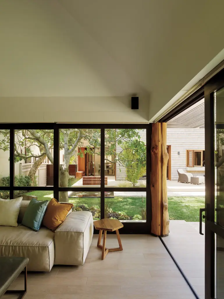
Architect Charles Debbas and designer Lane McNab transform an architectural oddity in Berkeley into a visual haven.
MICHELLE MUNSON, SERBAN SIMU, CHARLES DEBBAS AND YOURS TRULY ARE STANDING ON A LANDING. There’s a white oak floor underneath our feet and a door leading to a tiny outdoor area furnished with two Adirondack chairs and spiderwebs and branches that overhang from an enormous tree in the backyard. A more intrepid person, like, say, the couple’s 7-year-old son, might be inclined to try and climb on the roof from here. It’s right above the landing, after all. We’ve been standing on the landing for 20 minutes because the three of them, Munson and Simu the owners and Debbas the architect, want me to understand just how incredible this space is. And, once I get the story of how the house used to be, I believe them.
“It was the most horrible place in the house,” Debbas says of the second floor. “This was a small hallway with six doors.” It’s hard to imagine where six doors could have fit in this second-story private area that’s now accessed by an almost-floating stair that starts on the open and airy main floor. But this is Berkeley, where arcane and incomprehensible architectural traits are almost the norm for some of the houses here, particularly ones like this, which the owners bought for its location and its exterior and potential.

“We wanted the house. It has a great outside, the perimeter structure is very interesting, but the inside was disastrous,” Munson says. OK, six doors on a small hallway sounds dicey, but what else? They list the original flaws: a dark and creepy fishpond, a closed-off kitchen, terrible landscaping, barely any relationship between inside and out.
And then, they show off the successes, painstakingly introduced over a multiyear remodel: a fish and turtle pond that extends under the deck so that scared turtles can have a place to retreat; a completely redone pool house and nicely colored Jacuzzi; a completely opened-up inside that includes a synchronicity of spacious volumes conceived by Debbas with interiors by local designer Lane McNab; and landscaping in the front that cohesively draws the visitor from the bucolic street up some steps to see just the barest inflections of modern style, notably in the limestone of the massive panels outside echoed by smaller details inside. Why limestone? Because Michelle is from Kansas, where that stone is a major presence, so major that these particular materials were specially flown in.
The couple wanted their house to combine a fondness for Michelle’s former home state with their current embrace of California’s relaxed sensibility. Casual entertaining, a huge priority for them, took architectural shape in thoughtful spaces set aside for visitors and features equally conducive to large barbecues and intimate cocktail parties. (The bar, a particularly deft design feature, is slipped into a corner adjacent to the kitchen, expertly utilizing an area that might otherwise be wasted space.)
Debbas worked on the space planning and McNab selected the furnishings. “Lane was phenomenal at understanding what we needed,” Munson says. Owners, architect and designer all collaborated smoothly, remarkably so given their diverse starting points. While Debbas is a longtime Berkeley architect who came recommended by the realtor, the owners found McNab by searching online; where Debbas is the establishment, she’s the up-and-comer. “She really proved herself,” Munson says.

Playing off each other’s ideas and strengths, the designers found their contributions meshed well. “I felt like my job throughout the process was to help complement the elegance and beauty of the architecture as well as the warmth and approachability of the clients and their home,” McNab says. Debbas engaged fully with the details, like bringing in cabinetry hand-produced by local craftsman Brian Eby — material finishes that mainly made sense in the context of hand-dyed rugs sourced by McNab and the Lego-filled room of the couple’s son.
Of all the accomplishments and architectural sleight-of-hand, the greatest invisible trick might be the 40-foot steel beam that Debbas had builders install, a structural element that spans the entire length of the first floor and allowed the architect to completely open the space.
Which is another reason that landing is so crucial to admire. Because while it might look like mere clever design, when you know what it took to achieve it’s the epitome of architectural success.


