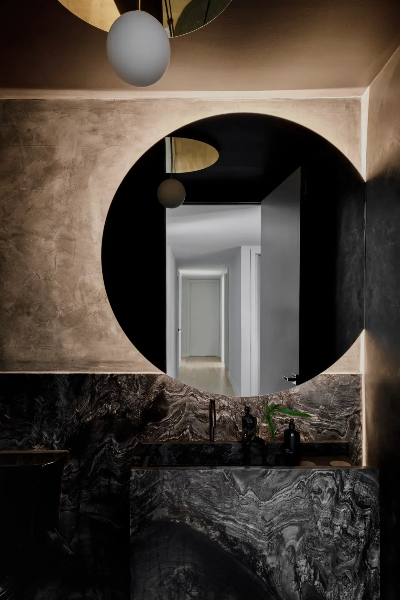
Connoisseurs of cultural trends, interior designers, Jennifer Kranitz and Aimee Wertepny knew exactly what their client meant when she asked for a “murdered out” powder room in her and her husband’s new Lincoln Park apartment. (The term refers to the black-on-black-on-black look that’s au currant among some car aficionados).
“They loved black and brass, so we created intentional punctuated moments,” Kranitz says, of her clients, who had recently located from New York City. “We identified areas where those elements could be really strong and then backed out from there.”
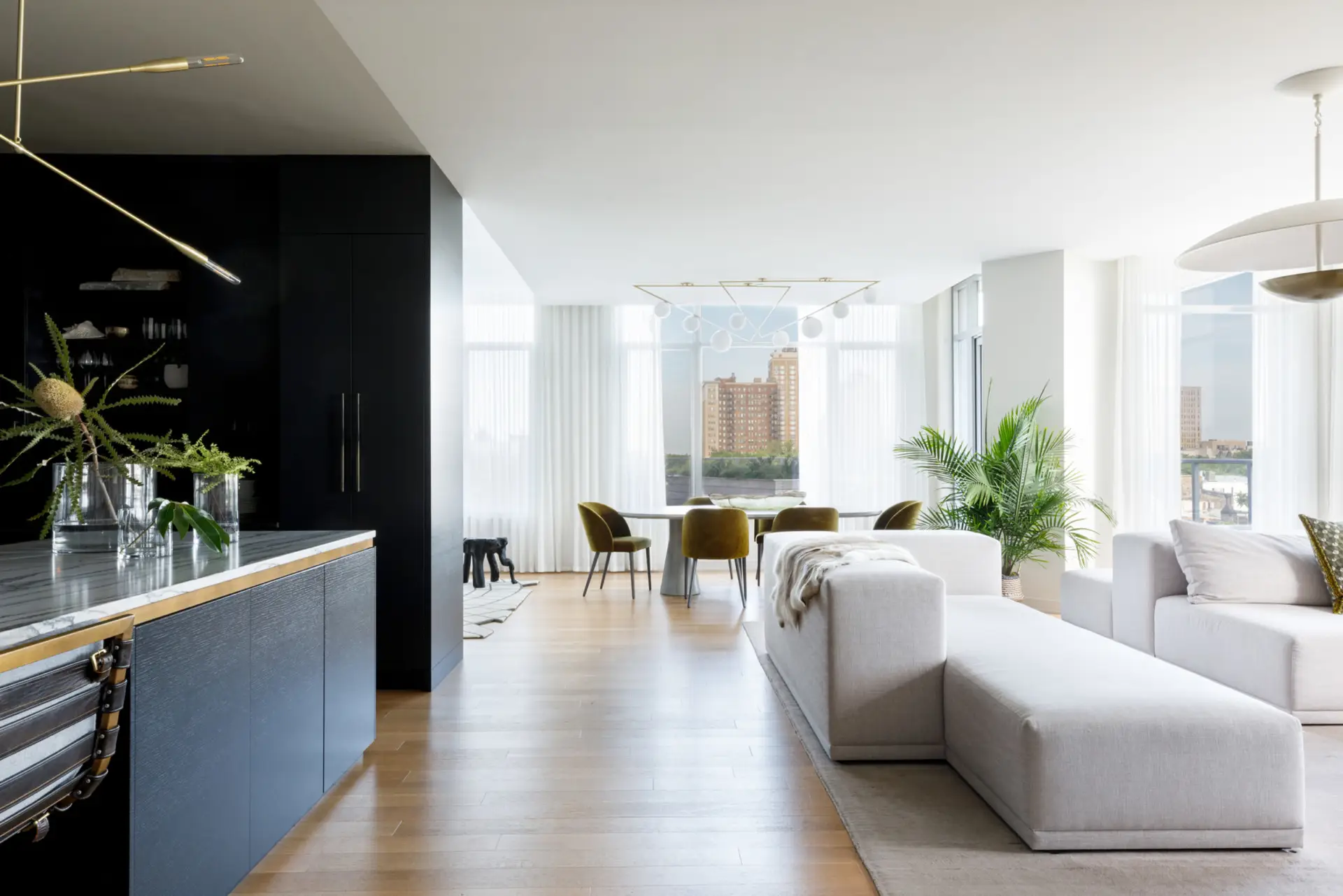
There’s also a proverbial chalk outline around the open kitchen, which sports ebony-stained cabinetry by Demeter Millwork, an integrated black leathered countertop and backsplash and a custom blackened steel hood. Open to the living room, Kranitz wanted it to “fade to black,” she says.

That’s not to say there’s no bling. A contemporary brass chandelier by Studio Dunn, for example, illuminates the white quartzite-covered island, which has a sleek brass reveal. “(The wife) has good taste – the way she presents herself and puts herself together,” the designer explains. “I knew the space had to be well-edited with fine detailing.”

The brass reveal is echoed in the built-in rift cut oak woodwork along one wall in the open living area – a focal point for a massive custom sectional with clean lines and thick, deep seats and arms. Sheers soften the linear architecture lines and frame dead-center views of the downtown skyline while sculptural house plans bring the treetops inside.
“She had an East coast, New York, fast-paced energy,” Kranitz says. “We wanted to build a serene environment.”
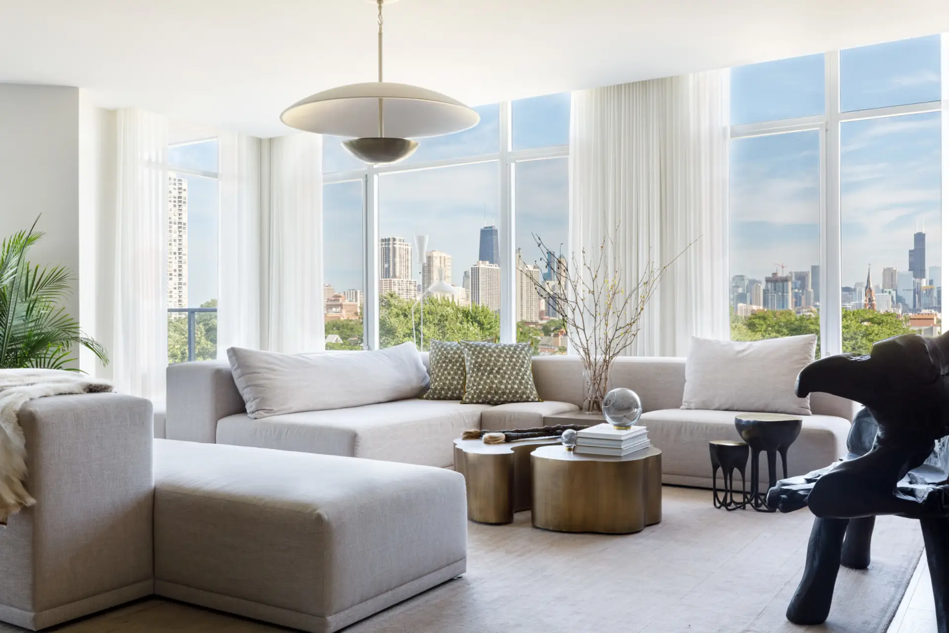
Organic, imperfect touches – a nod to the Japanese concept of Wabi-sabi, which accepts, even celebrates, flaws – enhance that sense of Zen. “The reality is we occupy our spaces, and they’re made to be used,” the wife says. “Do you want to live in a picture, or do you want to live in the real world?”
The way Kranitz sees it, there’s no need to choose. In the dining area, for example, a mod geometric brass chandelier by Atelier Areti elegantly illuminates a custom concrete double-pedestal dining table by Chicago Concrete Studio that’s as durable as it is elegant.
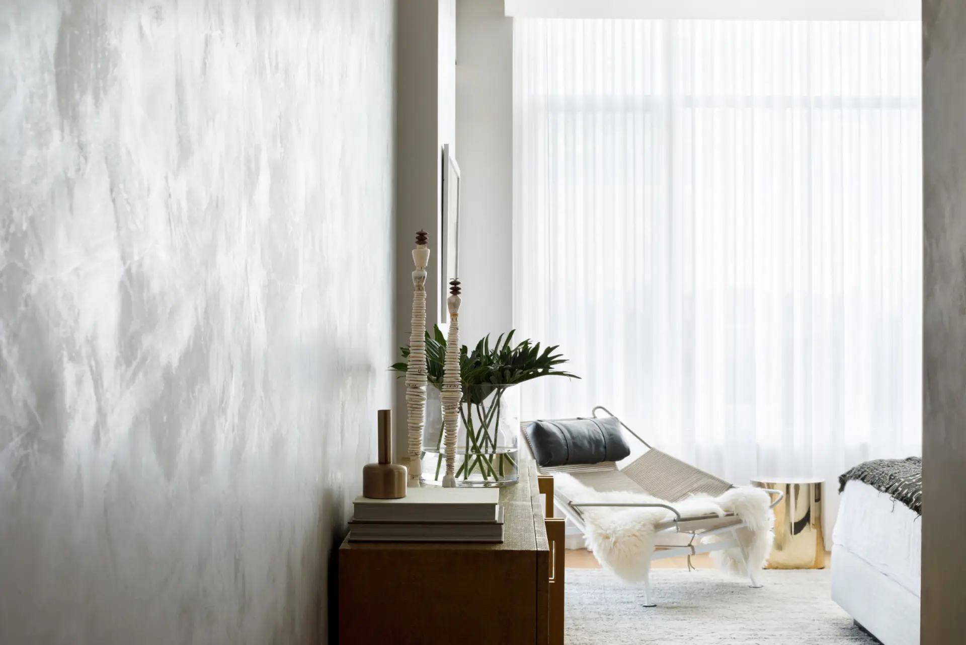
The interplay of sleek and organic can also be found in the owner’s bedroom, where the walls are covered with a textural finish by Studio BK that resembles Venetian plaster.
At first, Kranitz was vexed by the headboard wall, which has an inconvenient jag at one end of the room. Instead, she made it a focal point, covering the recessed portion with smoked glass and suspending a pendant by Anna Karlin from the ceiling over the bedside table. “It feels artistic and super-intentional,” she says.
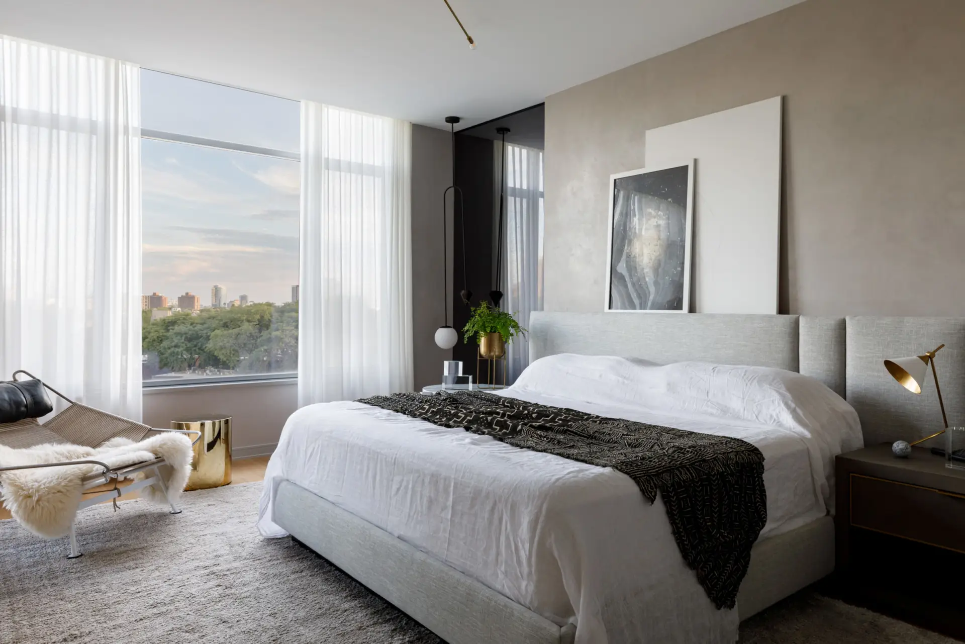
As does the guest suite, which was inspired by the ambiance in Tulum, where the owners once traveled for a pop-up dinner. In lieu of color, Kranitz leaned into texture, incorporating a large patterned rug with black fringe, a woven chandelier and a macrame wall hanging over the bed. “Texture is our secret sauce, the PROjECT vibe,” Wertepny says. “It’s easy on the eye.”

As evidenced by the husband’s office, however, she has no objection to color. The space has deep blue walls punctuated by a velvet chaise lounge by Mitchell Gold + Bob Williams and leafy green house plans. “It’s a destination” Kranitz says, noting the space is self-contained from the rest of the house.
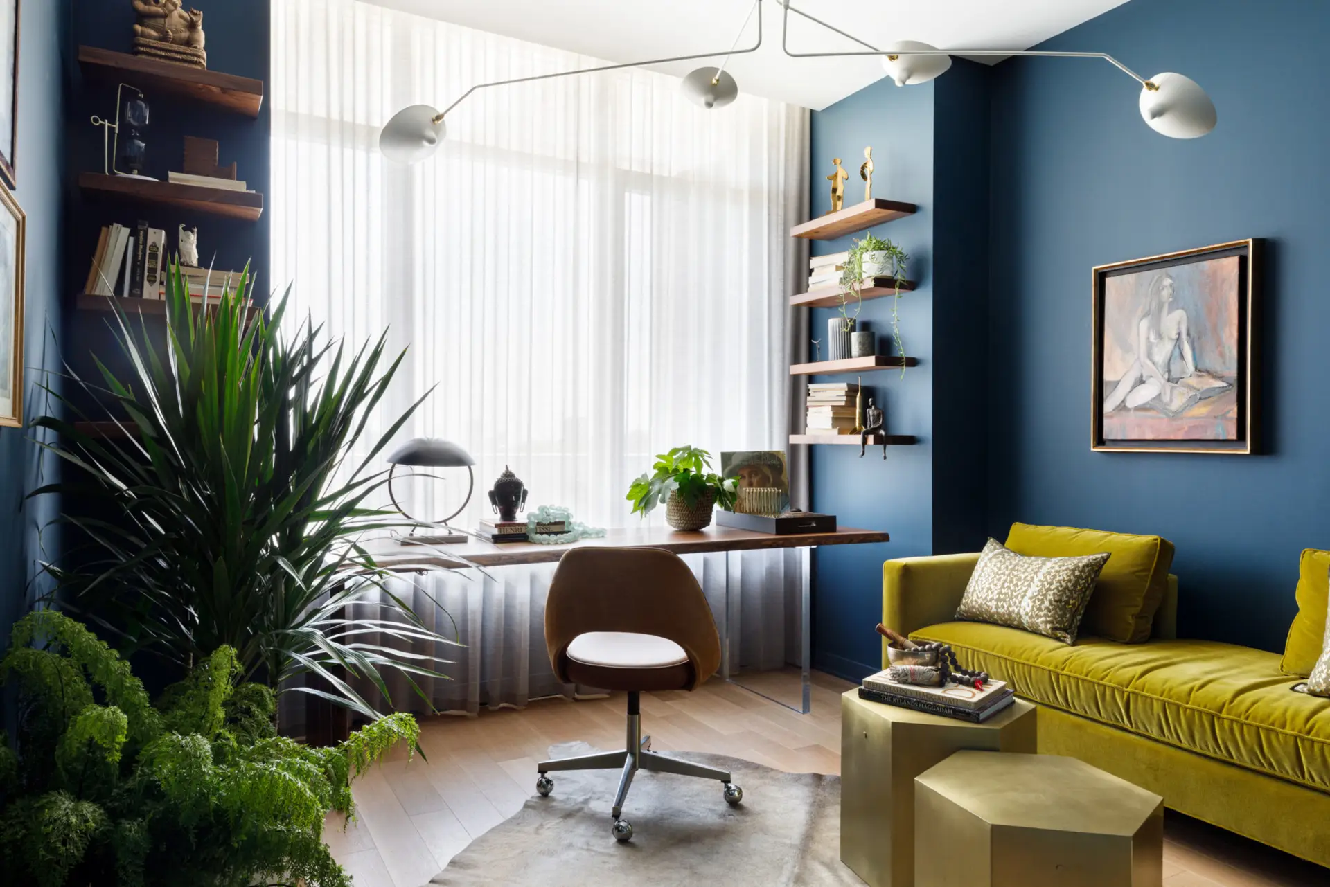
The owners are overjoyed with how the space turned out and have no regrets about relocating from the Big Apple. Indeed, their expansive patio alone is nearly the size of their New York apartment, which took some of the sting out of the COVID-related shelter-in-place orders.
They credit Kranitz and PROjECT. interiors for interpreting their wishes, no matter how inarticulate they might have been. “Sometimes I would just wave my hands around, and Jen would know what I was talking about,” the wife says. “They did such a wonderful job of making our home feel modern yet warm and functional.”
Key Players:
Interior design: PROjECT. interiors Construction: Eighty-Eight Design + Construction
More photos by Aimée Mazzenga:




More from SPACES:
- A Look Inside BIÂN, Chicago’s Newest Luxury Health and Social Club
- Retro Revival: This Hillside Home in Corte Madera Is Playful and Bursting with Color
- A Thoughtful Renovation: A Vintage Kitchen Gets a Bright and Airy New Look in a 1930s-Era Brick Tudor Home

Tate Gunnerson is a Chicago-based freelance journalist with an equal appreciation for natural beauty and good design. He is a passionate supporter of St. Jude Children’s Research Hospital and the National Kidney Foundation.

