“No Barcaloungers here!” declares San Francisco-based designer Tineke Triggs about the house she designed for a single guy. It’s definitely not your stereotypical bachelor pad.
“When you create a space, you want to recognize the person,” Triggs says. In this case, her client was a gentleman with excellent taste and a blue-chip art collection. He brought in Triggs shortly after he purchased the new construction house and asked her to elevate its style.
The 4,000-square-foot house is on a hill, with a flipped floorplan that takes advantage of the views of Sausalito and the water. The lower level holds the guest bedrooms and family room. The top floor, accessed via a central stairway, opens to the living room, dining area and kitchen. The top floor also includes a small library area and the primary bedroom.
“The space was very contemporary and clean, but not that interesting,” recalls Triggs, who owns her own full-service firm, Artistic Designs for Living. She likes to find her way to a home’s style by really taking time to get to know the client.
THE LIVING ROOM
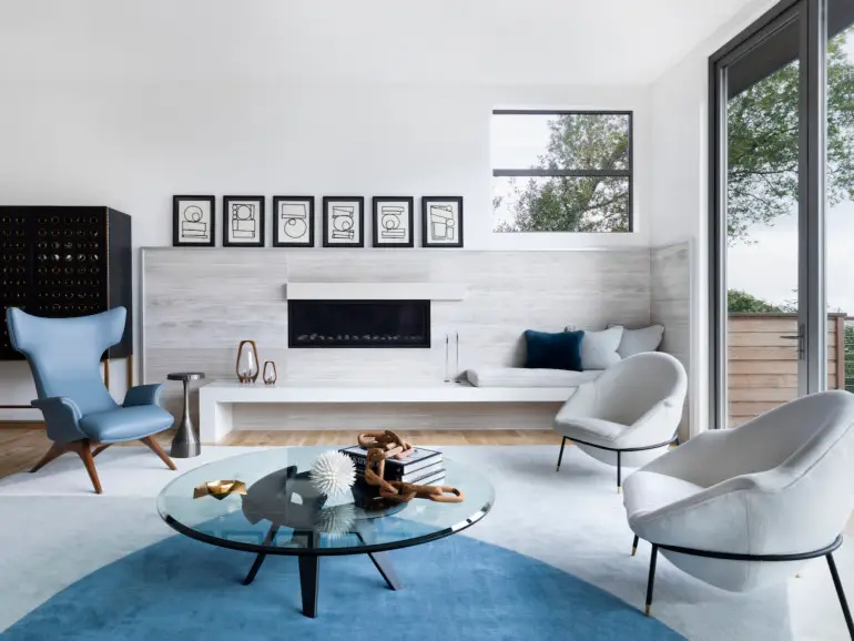
“Since he loves cars, I wanted it to feel masculine, but with a unique vibe,” she says. “I took inspiration from his Porsche collection, which he races, and thought a lot about classic cars when looking at materials.” She leaned into the beauty of vintage race cars by embracing their luxurious materials and flowing curves.
In the main living area, this inspiration led Triggs to design a custom rug—featuring large-scale curved shapes in blue, gray and cream—as the foundation of the room.
“I made the coffee table glass because I really wanted to see that rug,” she says. “I love the shape of the coffee table with its interlocking legs. They’re made of wood, but where they come together looks like an engine part or a gear.” To those new pieces, Triggs added a classic Vladimir Kagan wingback chair and two vintage chairs that she purchased in Paris.
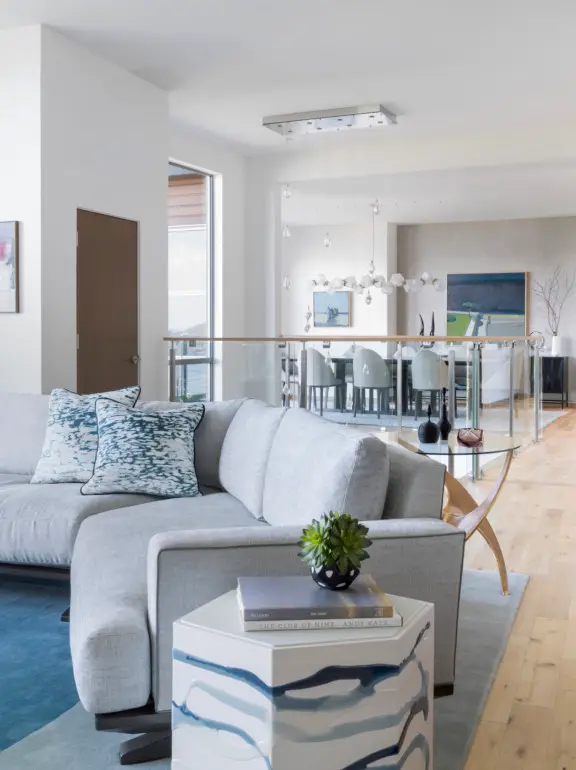
The biggest challenge she faced in the living room was its dual focal points: the view and the fireplace.
“I custom designed the sofa to take advantage of both the fireplace, which is right in front of you, and also the view of the Bay, which is off to the right side,” she says. “I opened the sectional and made an obtuse angle, so you’re open to both views.”
THE BREAKFAST NOOK
With that clever solution in place, next Triggs tackled the home’s lackluster lighting.
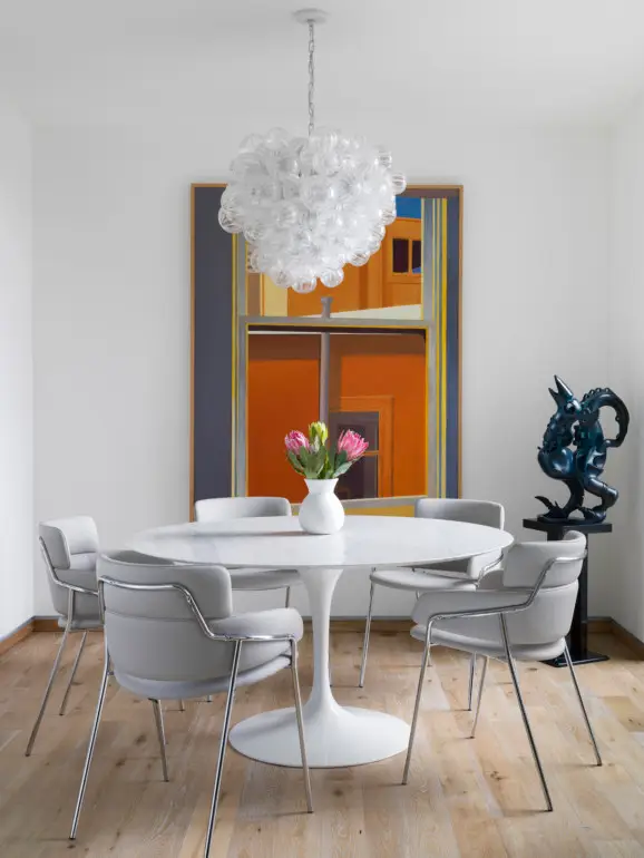
“Light fixtures can really change the look and feel of a space, so I got rid of all the pedestrian lights,” she says. “I peppered in some midcentury finds and some newer pieces.”
The breakfast nook has one of the midcentury treasures—a bubbly creation that sets a happy tone for the morning.
THE DINING ROOM
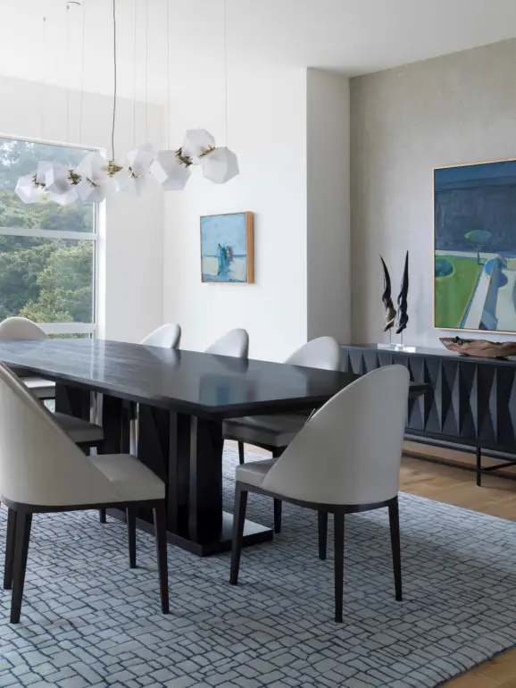
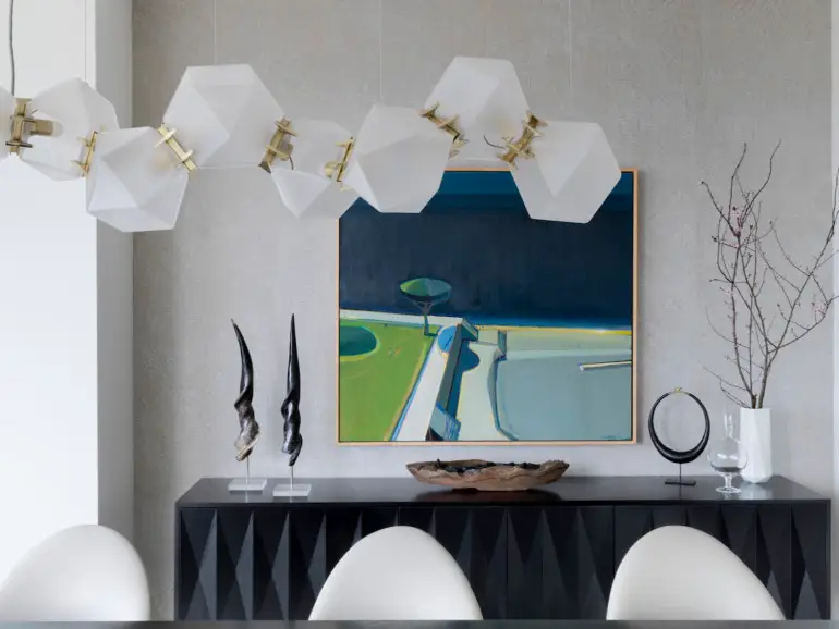
In the dining room, Triggs wanted a visually engaging fixture that wouldn’t take away from the view. She chose a geometric chain of lights connected by brass accents; it provides plenty of interest without dominating the room.
THE ENTRYWAY
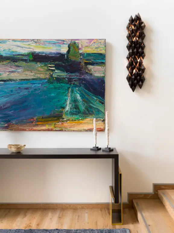
The final light fixtures of note are the bronze and satin brass sconces she designed for the entryway, which evoke light emanating from the rough texture of a cave. “This space didn’t need a lot of light, because there’s a chandelier hanging above,” she says. “We added these sconces to bring in some drama.”
THE STUDY
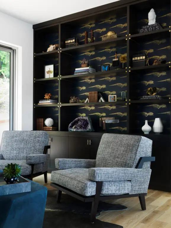
Another design challenge was providing a cozy space where the homeowner could watch television or read. Triggs created a comfortable sitting area that’s separated from the main living space by a single wall. She added custom built-in bookcases on that wall and the opposite wall, which flank a large window. One bookcase hides a television behind sliding doors. While the bookcases are stunning in their own right, Triggs added another layer of interest by lining them with a wallpaper featuring a print of a whale skeleton, a subtle nod to the home’s surroundings.
THE PRIMARY SUITE
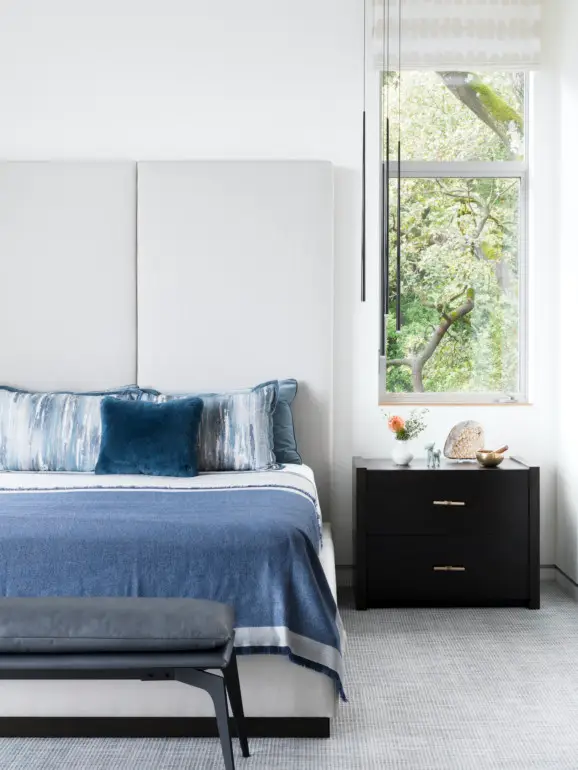
The main bedroom, with 10-foot-high ceilings, is a serene space. “Because of the tall ceilings, I wanted to gravitate up,” Triggs says. “I love pendant lights or sconces that are off the bedside tables. And, naturally, we chose a high headboard to fill the space.” The soft blues and grays of the main living spaces flow into the bedroom.
When the client is the focus, Triggs finds that the spaces she creates are used and loved over time. That has certainly been the case for this house. “When you design for someone, you create a home that complements his style,” she says. “I didn’t create a trendy environment, so, that keeps it relevant.”
More from SPACES:
- Savor the Earthy Tones of this California Craftsman Home, with a Glorious, Rustic Kitchen
- Tomatoes, Passion Flowers, Kumquats and More: It’s Spring Year-Round at this Tudor Home with a Bespoke Victorian Greenhouse
- This Marin County Home Balances Light and Dark, with a Dramatic Wet Bar as the Focal Point

Laura Hine is a design and style writer based in Brooklyn. She’s a former editor-in-chief of Better, as well as the Modern Luxury publications Interiors Chicago and NS.
