Heidi and Kevin Noonan, along with their three children, moved to the Forbes neighborhood of San Rafael after outgrowing their two-bedroom, one-bath Spanish style home in San Anselmo. The area’s beautiful tree-lined streets, abundance of young families and older houses appealed to them. Plus, Kevin grew up in San Rafael and still had family there.
The couple found an 1867 Victorian that “needed a lot of work,” Heidi recalls. “But the intricate moldings, high ceilings and overall ‘good bones’ drew us in.”
TAKING INSPIRATION FROM THE VICTORIAN ERA
The couple hired the Berkeley-based firm Fischer Architecture, whom they’d worked with previously, to remodel and renovate the historic, two-story home. The wish list included a new primary bedroom, with a walk-in closet, a new primary bath, an upstairs laundry room upstairs and a new, larger kitchen with views to the backyard.
The couple also wanted an addition, to enlarge many of those spaces, bring in more light and improve the flow throughout. “They wanted an addition that was very modern, so that was the aesthetic springboard,” says principal Kerstin Fischer, who worked on the project with her husband, Andrew, who is also a principal at the firm.
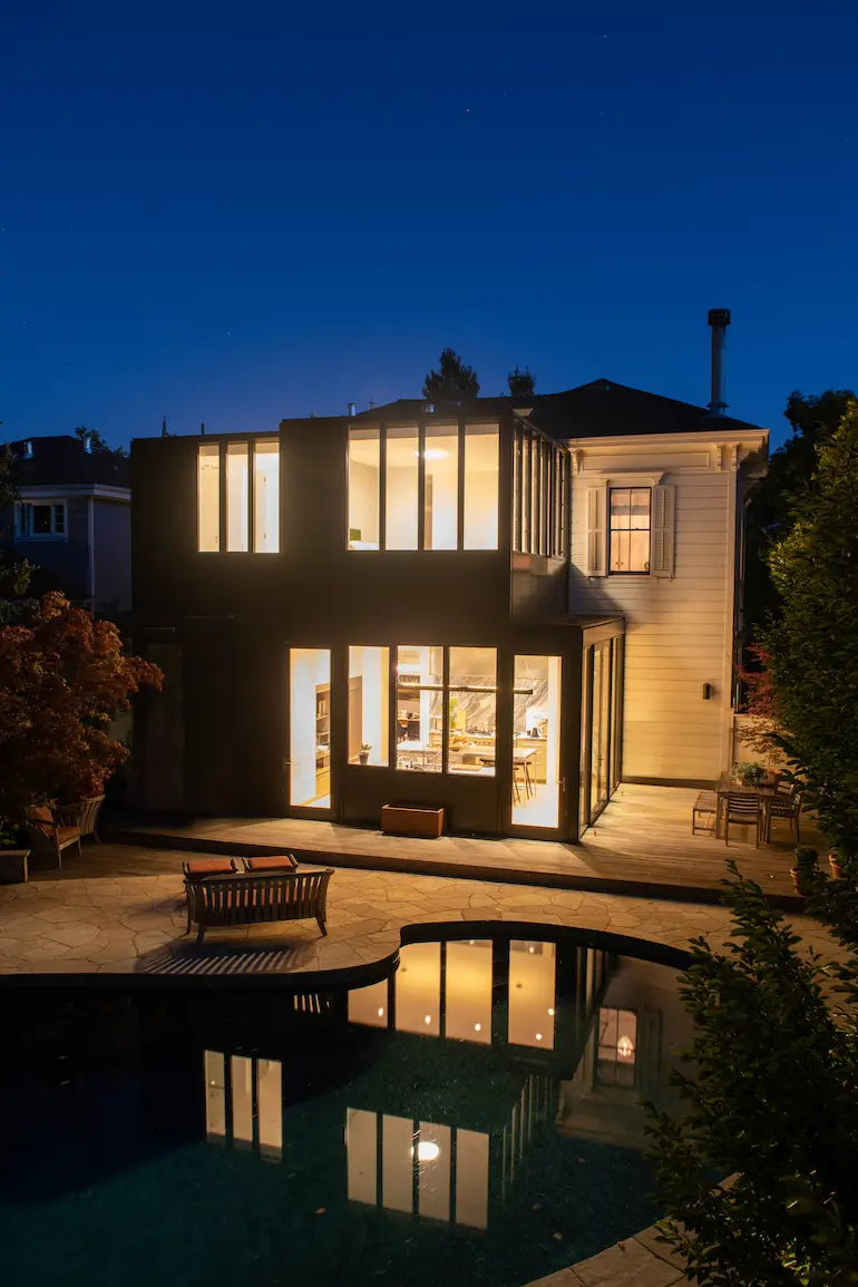
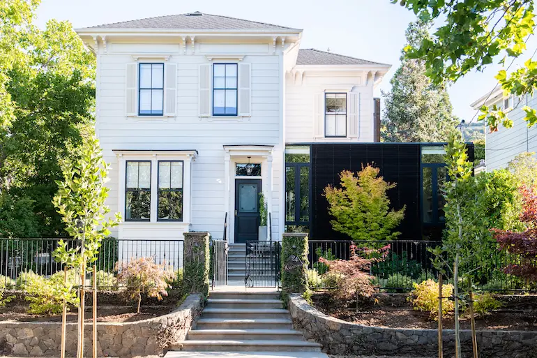
The L-shaped, Italianate Victorian, once a farmhouse, had seen the addition of a porch in its early years, which was later enclosed. Working with the existing footprint and foundations, the architects designed a striking new addition in glass and painted steel panels, with rain-screen siding made of oxidized redwood.
“Our intent was to design the addition using informal materials, akin to a garden structure,” says Fischer. “Clad in redwood boards, the addition on the street-facing elevation of the house references a trellis or simple fence. At the rear, the taller and more predominant addition in steel and glass references the historical sun porch, or conservatory, features of many Victorian buildings. This informal expression helps maintain the hierarchy of the existing house over the addition.”
CONNECTING OLD AND NEW
To connect the modern addition, the architects subtly slid the flat-roofed structure under the Victorian’s decorative eave line. As historic guidelines dictate that a distinction between the old and new can be read, the architects didn’t strive to mimic the original house, but to take cues from it. “We followed the tall and narrow proportions of the windows of the existing house,” says Fischer. “It was important to keep that verticality.”
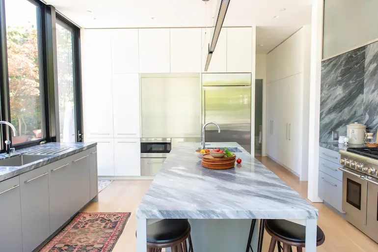
At the rear of the house, where there were previously no windows, the bottom level of the addition houses the new kitchen and a small bedroom with a bathroom. Previously tucked behind a laundry room, the kitchen today features clean lines, custom cabinetry and timeless materials like Bardiglio marble. It opens up to the inviting backyard with an existing pool, coach house and a new, ipe wood deck to the west.
“It’s kind of a glass box,” says Fischer.
A BEDROOM WITH A VIEW
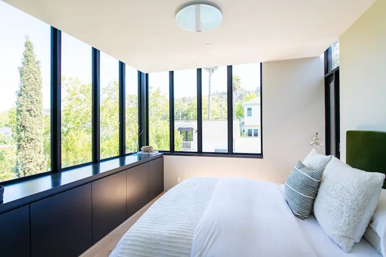
Upstairs, the addition houses the new primary bedroom and bath. The latter seamlessly extends across to the new walk-in closet, where an internal door opens into the newly placed laundry room, which is also accessible from the landing. The bedroom offers an expansive view of the hills to the north, through windows that wrap around two sides.
LIVING AREAS THAT FLOW
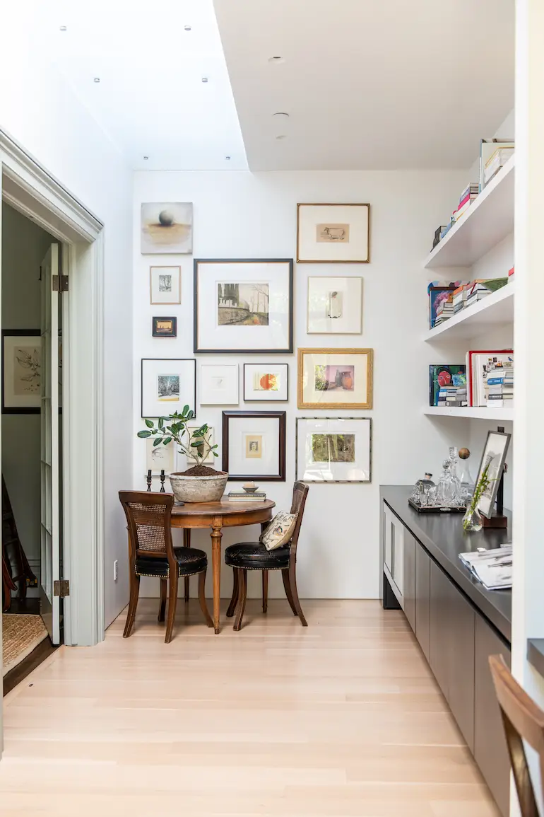
Downstairs there are now clear through-lines from living room to kitchen, kitchen to dining room and from one room to another. The addition’s eastern portion houses a modest library space that extends in a line to a home office area, which flows into the family room.
“Located on the property line side of the house, where California building code doesn’t allow for windows, here windows were actually removed and supplemented with a skylight in frosted glass,” says Fischer.
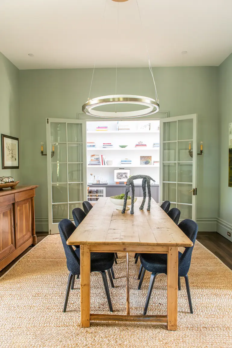
Along with new wood floors and several striking pendant lights, the house got fresh coats of paint, including “a soft blue,” as Fischer describes it, from Farrow & Ball, in the upstairs landing. “It creates a cozier feel and hearkens back to the original farmhouse,” she observes.
Thoughtful details—like the window shapes on the addition, the frosted glass skylight and tucking in the modern structure beneath the Victorian eave line—are ultimately what made the result a success, according to Fischer and the owners, who were thrilled with their new home. Heidi says, “Kerstin and Andrew did an amazing job marrying the old and the new.”
More from SPACES:
- ‘The Expert’ Lets You Book Virtual Consultations With Top Home Interior Designers: We Picked 5 Favorites
- This Chicago Loft Home is a Study in Minimalism and Texture
- Be Enchanted by This Hotel’s French-Chateau Style, Plus 5 Tips on How to Achieve the Look at Home
 Joann Plockova is a design writer with bylines including The New York Times, Wallpaper and Azure. Her first design book, Come Together (Gestalten), will be released internationally in November 2021.
