Like so many things this year, the San Francisco Decorator Showcase went virtual. But that didn’t stop the premier design show on the West Coast from making a strong impression, to say the least. The free virtual experience launched on Saturday, May 22, and will remain live through the summer. So, there’s still time to feast your eyes on some of the best design around.
Ten of the Bay Area’s leading designers came together to create virtual spaces in 1080 Chestnut Street, a Russian Hill penthouse with 360-degree views of San Francisco and its landmarks. The building dates back to the ‘60s, and, for the most part, the designers kept the furnishings sleek and modern, with dramatic contemporary art and sculptural lighting.
There were some groovy nods to the ‘60s and ‘70s: Martin Kobus created a living room and bar with sinuous furnishings inspired by luxury high-rise living of that era. The teen’s bedroom, by Chroma, has occult and futuristic vibes. Exploding with rebellious color, it features an embroidered and beaded headboard and ‘60s wall lamps.
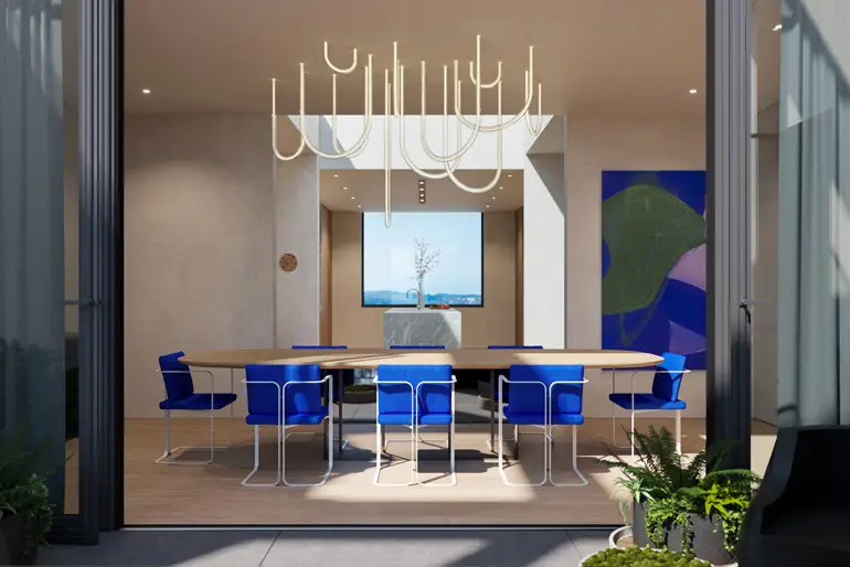
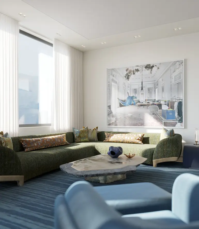
Celebrating the penthouse’s expansive views—11-foot glass panels slide open to a panoramic view terrace off the dining room—was also important. The family room by Geoffrey De Sousa reflects the rich blues and greens in the surrounding landscape, and Catherine Kwong set the master bath vanity against a huge window, so the owner can enjoy the landscape even while he or she is looking in the mirror.
The participating designers were Applegate Tran Interiors, AubreyMaxwell, Catherine Kwong, Chroma, DLC-ID, Geoffrey De Sousa Interior Design, KOBUS Interiors, Peruri Design Company, Studio Collins Weir and studioHEIMAT. The event raised money for San Francisco University High School Financial Aid Program. Below are a few of our favorite rooms from the showcase.
THE DINING ROOM
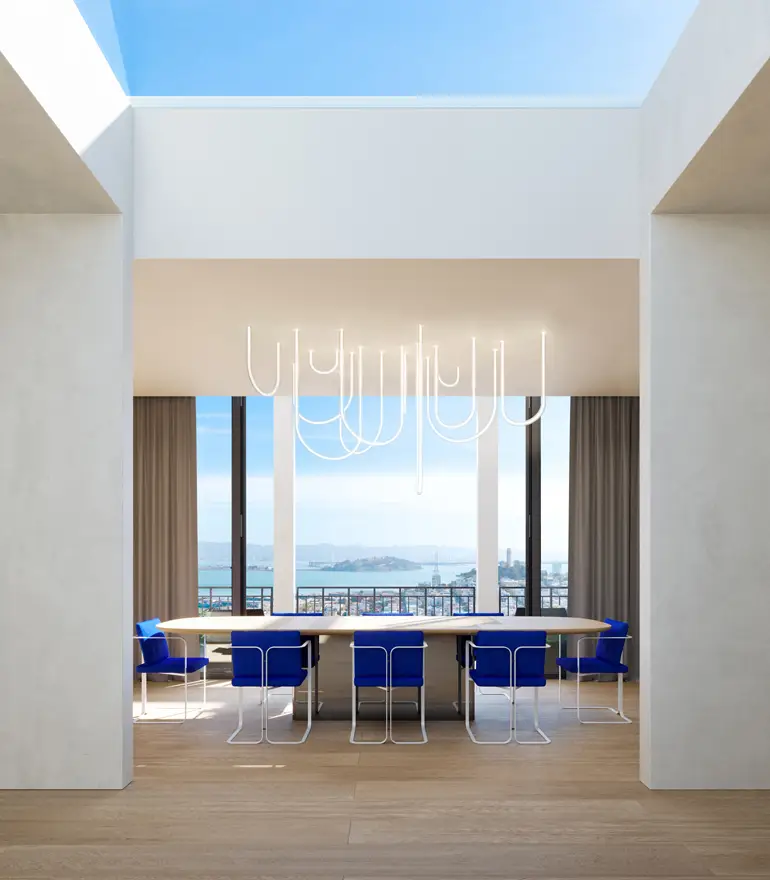
Studio Collins Weir designed the dining room, kitchen, atrium and terrace center, imagining that the owners of the penthouse—which is currently for sale—would be empty nesters who would want to use it for chic, grown-up gatherings and showcasing their art collection. “Our spaces are rendered in simple plaster, wood, and natural stone, along with judicious pops of color,” principal Susan Collins says.
THE KITCHEN
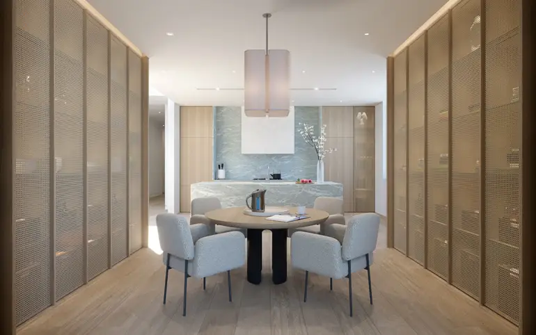
Studio Collins Weir also designed the kitchen, where understated rift white oak throughout leave space for the island and backsplash, in serene Verde Antigue marble, to really shine, evoking the penthouse’s capacious views of water and sky. All the kitchen’s trappings are cleverly disguised behind caned millwork doors.
THE FAMILY ROOM
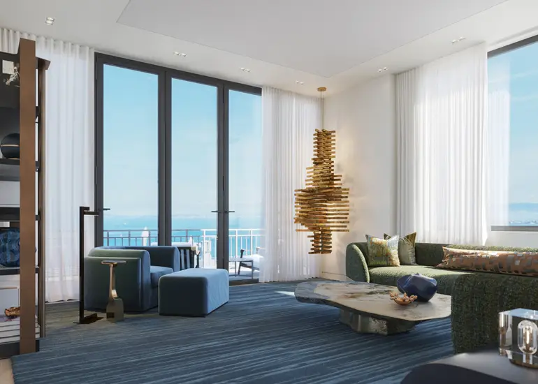
The family room by Geoffrey De Sousa (of De Sousa Hughes showroom in the San Francisco Design Center) is elegant yet exudes a welcoming comfort. The palette of blues and greens is taken from the bay and the hills. “This room is focused on family conversation and handcrafted, one-of-a-kind furnishings,” De Sousa says.
THE DRESSING ROOM
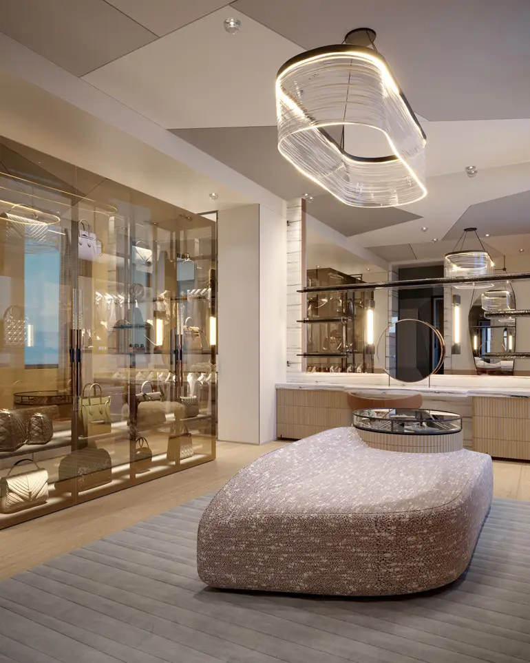
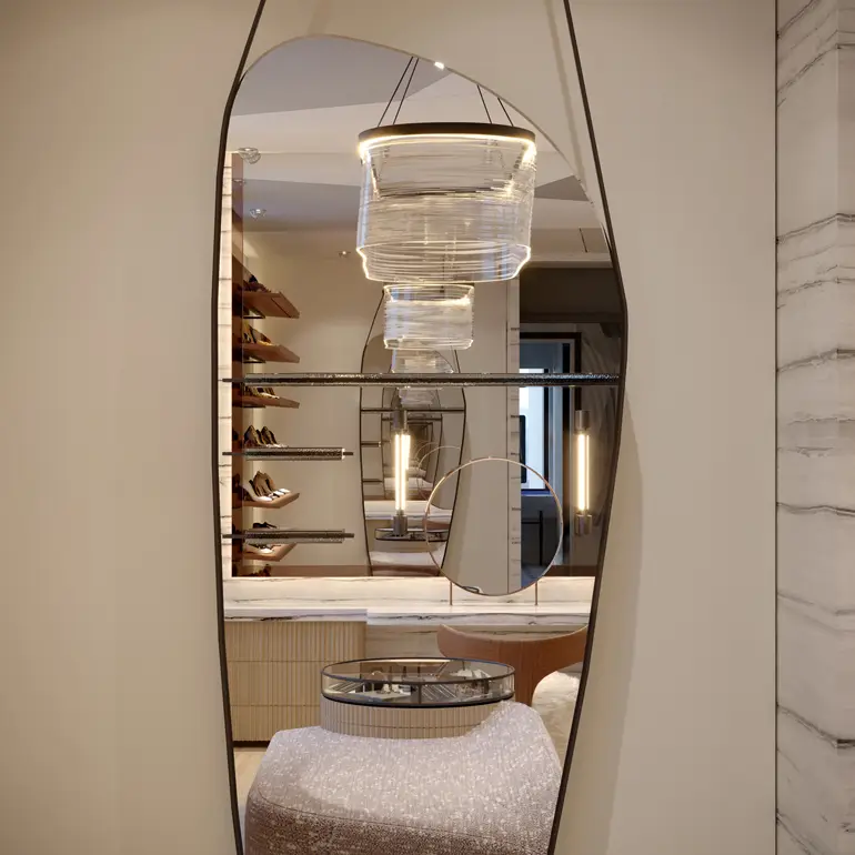
Dressing is an art form, and so is this closet, which epitomizes modern glamor. Applegate Tran Interiors intended this space for an international stylist. “The ambiance reflects her femininity and confident edge,” they write in their description. The duo also drew inspiration from Hollywood’s Golden Age.
More from SPACES:
- See How a Plain Dutch Colonial Became a Cool, Modern Farmhouse
- After a Fire, a Colonial House is Transformed into a Stylish, Modern Abode
- This Historic Cottage in Napa Valley Has a Kitchen Built for a Chef
 Liz Logan is the editor-in-chief of SPACES. Her writing about art, design and lifestyle, has appeared in numerous publications, including The New York Times, The Wall Street Journal, O, The Oprah Magazine and Martha Stewart Living.
